Roger Mooking
Roger Mooking’s burgeoning fine-art practice is grounded in collaboration. His 2026 Analog Print Residency at Smokestack was embraced as another opportunity to expand his work in printmaking with artistic collaborator and friend, Laine Groeneweg. Focused work with large-scale silkscreen printing and gold-leaf offered exciting processes for experimentation and creative exploration.
-
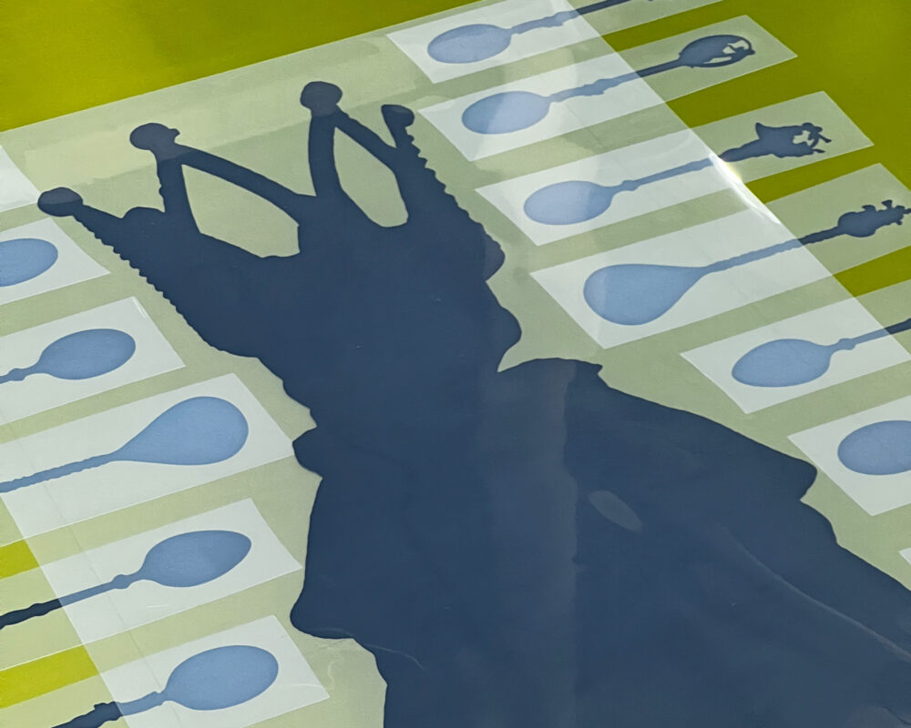
Every screen printed image begins with creating a screen. This can be done in a number of different ways using various processes, but no matter which way we go about it, the end result is a stencil on mesh. In Roger's project we used digitally printed films and some of those films we hand composed directly on the screen to create images that were more human.
-
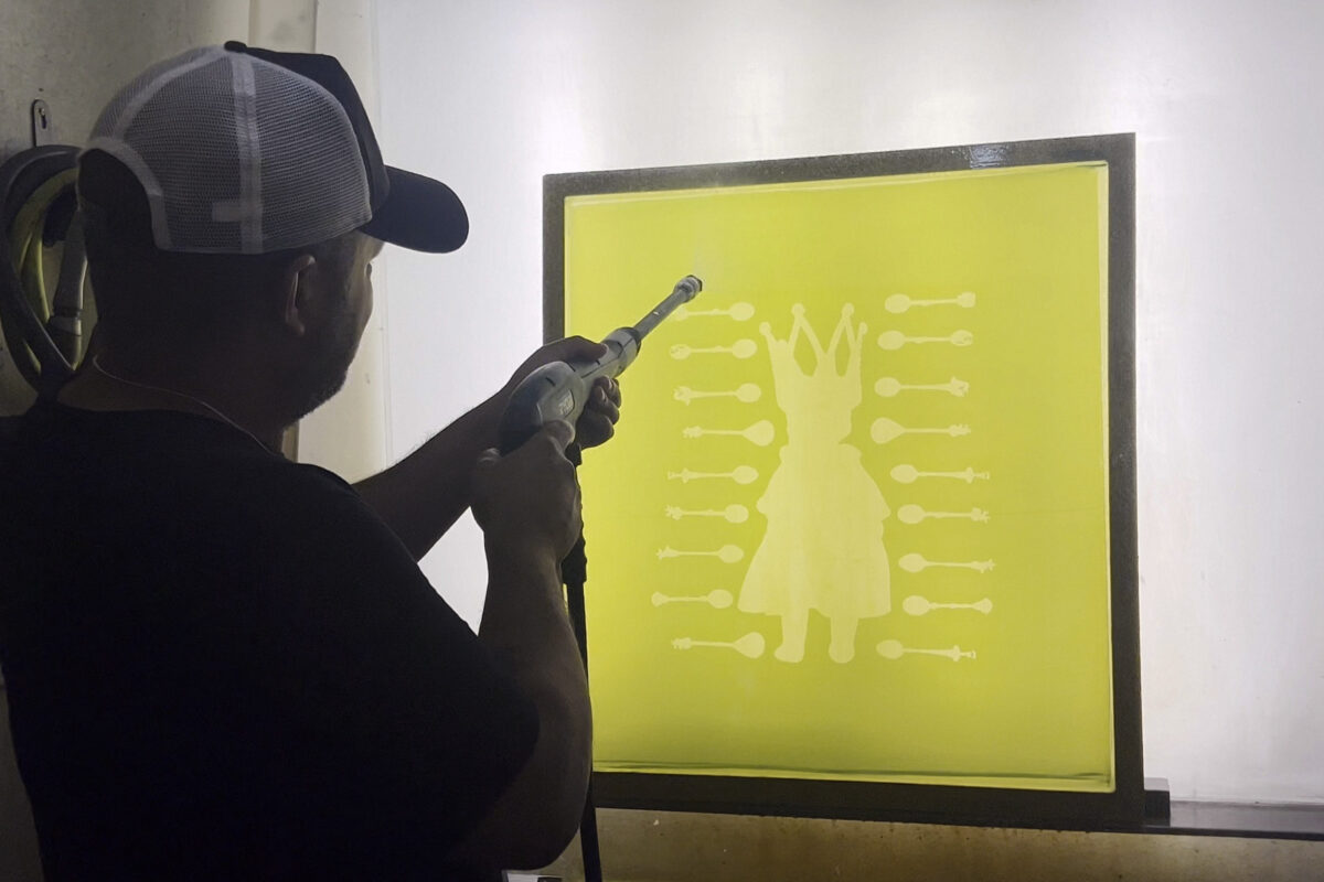
UV light is used to expose the film pieces to a light sensitive emulsion (the green on the screen). Once exposed the screen is then washed with water and the areas where image information existed on the film rinses away easily to produce open areas in the mesh. The remainder stays fused to the screen. Here you can see Roger washing out one of the image screens used in the project.
-
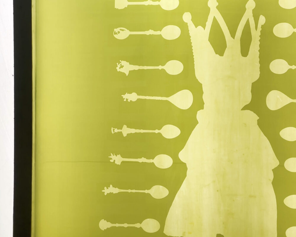
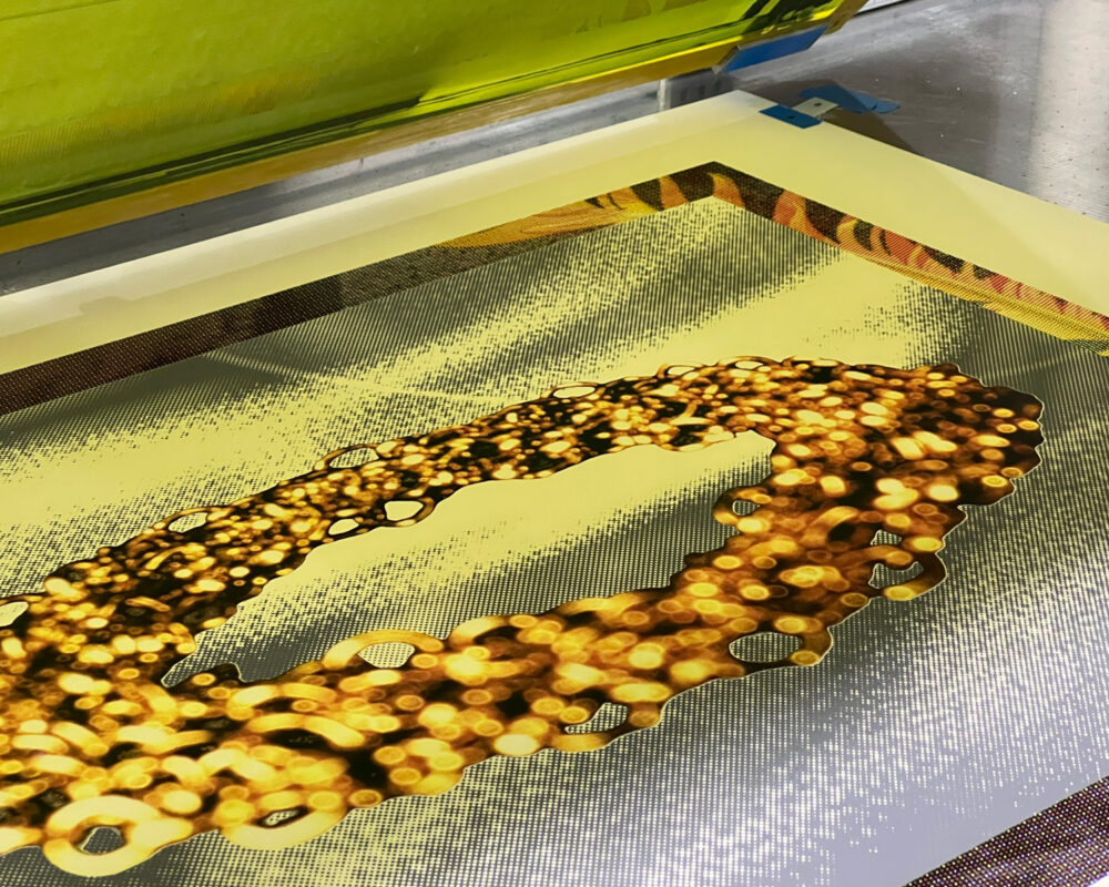
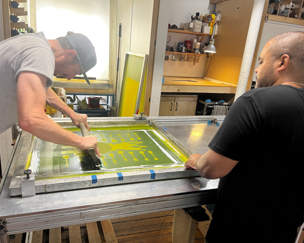
When the screen creation is complete you have a final result of a perfectly rendered stencil fused with the fine mesh of the screen. Through this stencil we can pass ink. We used this one for the exhibition edition print – "Feed The Beast"
-
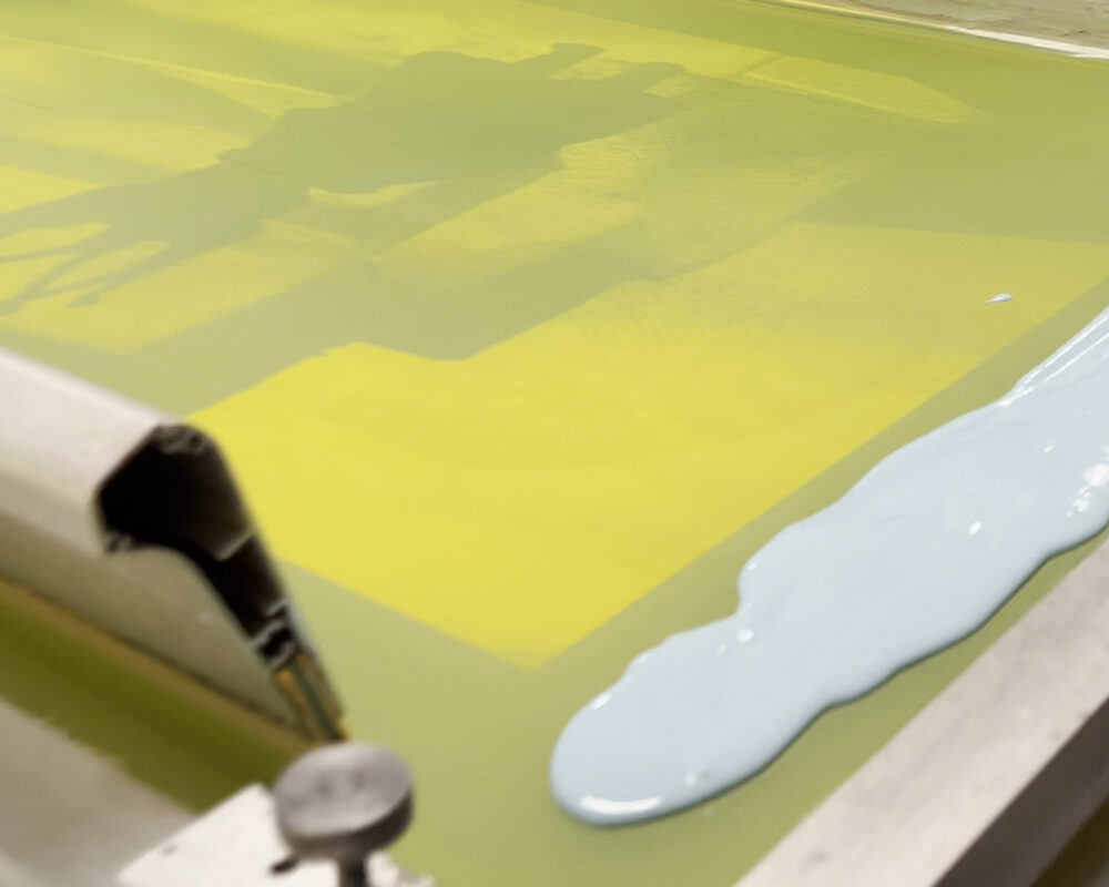
When printing, ink is applied to the screen and a rubber squeegee is used to pull the ink through the stencil.
-
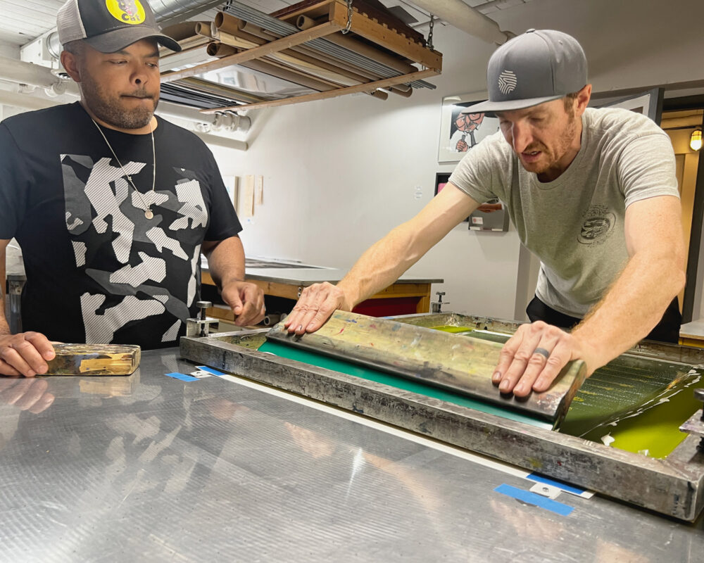
Using consistent pressure and speed during the pull of the squeegee is important to getting consistent impressions. That said, even with the best intentions, the process of hand-printed silkscreen prints inevitably offers moments where slight differences from impression to impression can take place.
-
-
-
-
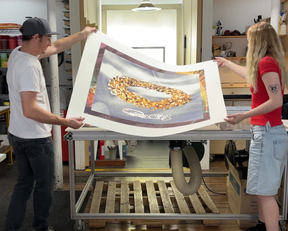
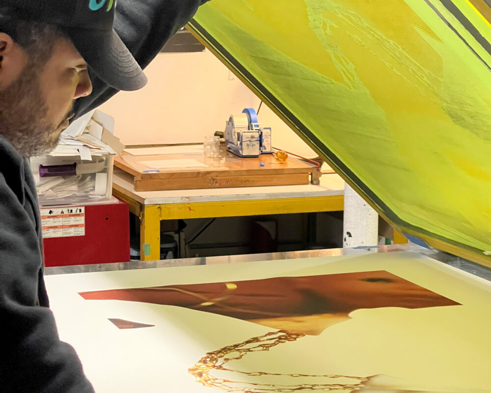
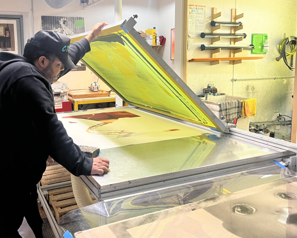
And of course, as the prints get larger sometimes we need more hands to move them all around!
-
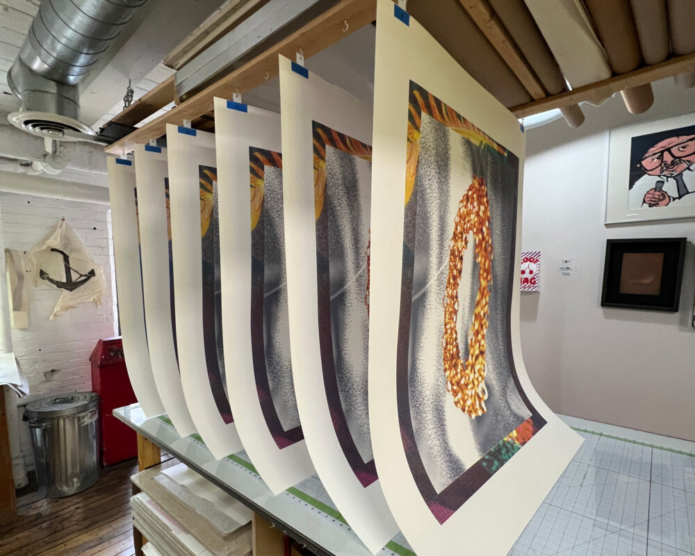
With the current setup here at Smokestack, we often hang larger prints vertically. One reason is because of the smaller size of our drying rack, but also it gives a slight bit of tension as the prints dry. We've found that just a little bit of gravity in the mix produces a flatter print as the layers of ink build.
-
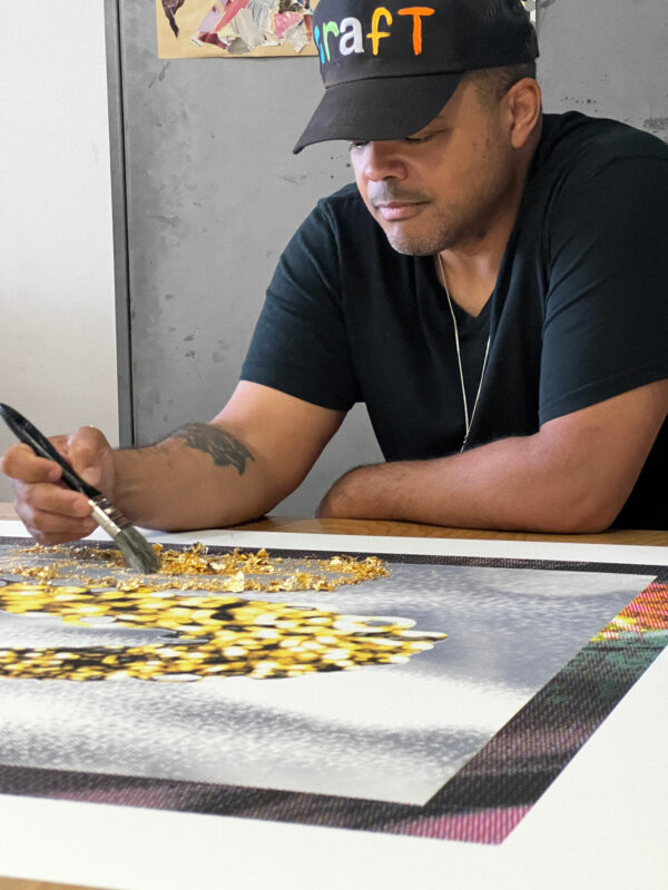
In Roger's project work here at Smokestack we made use of a fun gilding technique. This allowed us to have pops of shiny gold elements within the image.
-
To achieve the gilding, we first started with printing a very tacky adhesive. This formulation remains tacky indefinitely and gives us a long working time between printing the adhesive and subsequently applying gold leaf.
-
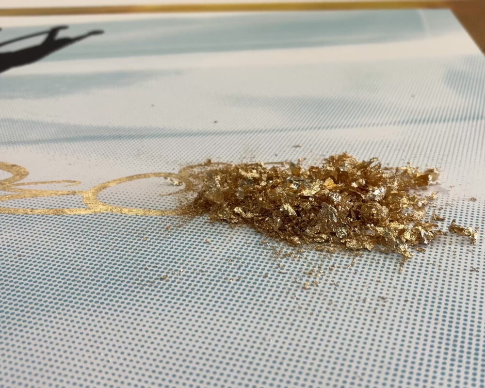
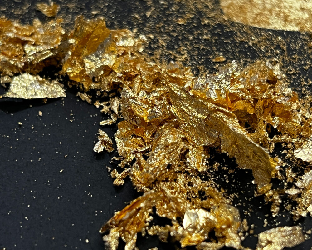
With the adhesive now printed on the surface of the print we then add gold flake to the surface. We chose to use flakes of gold as opposed to sheets because it offers a distinct textural quality that really added energy and movement to the work.
-
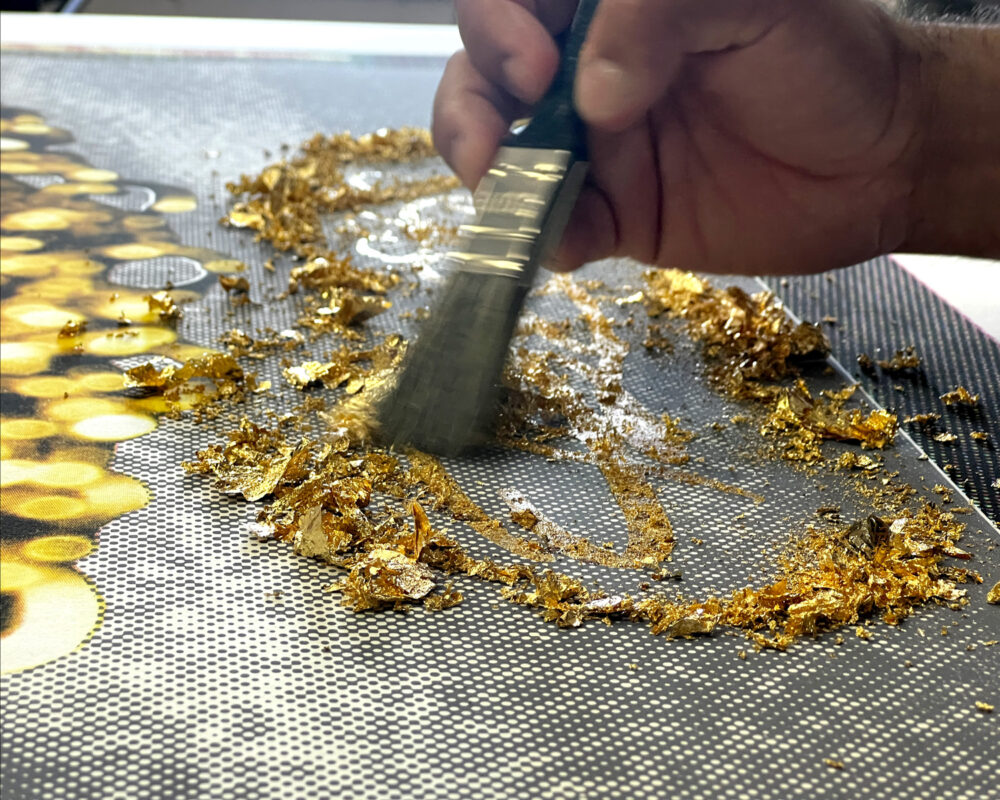
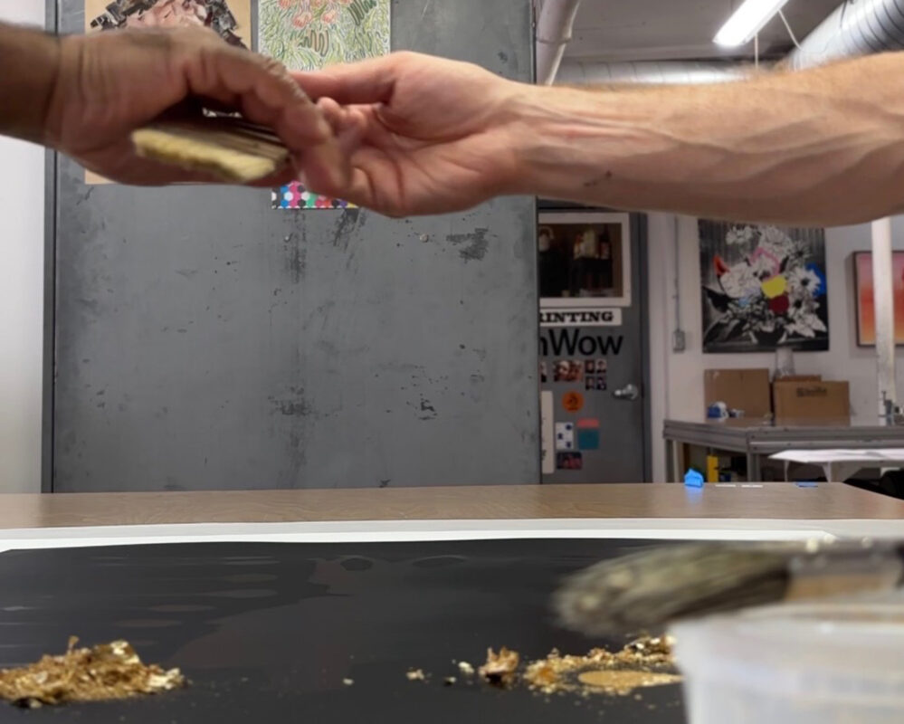
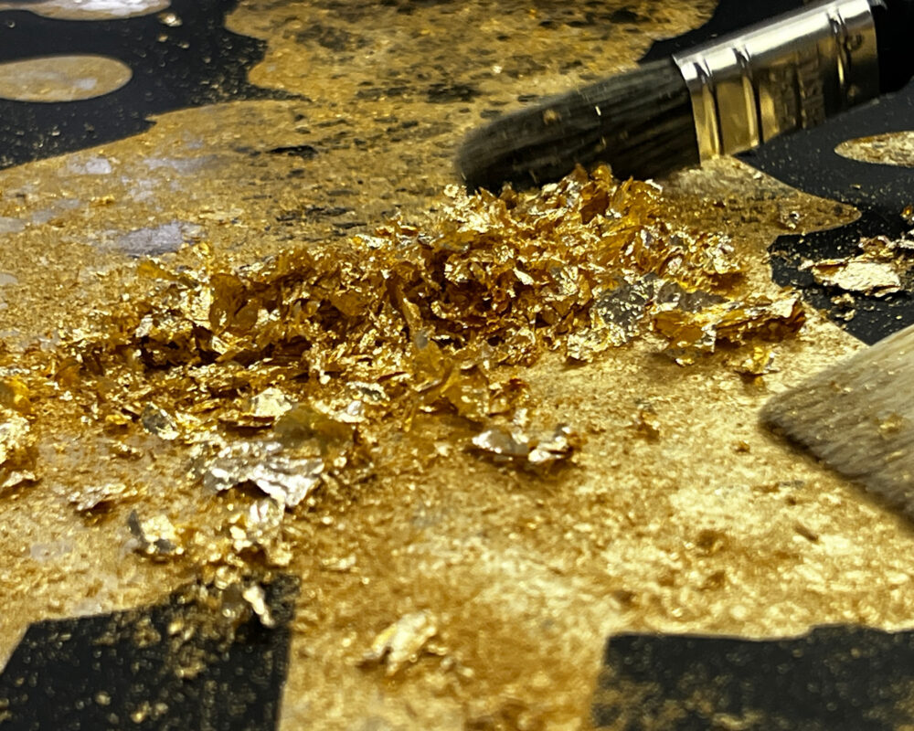
The gold flake sticks to the adhesive areas and remains free to move areas. When a soft brush is manoeuvred over the surface of the the gilded areas the un-stuck flake goes away while the rest is constrained to the ahesive image areas.
-
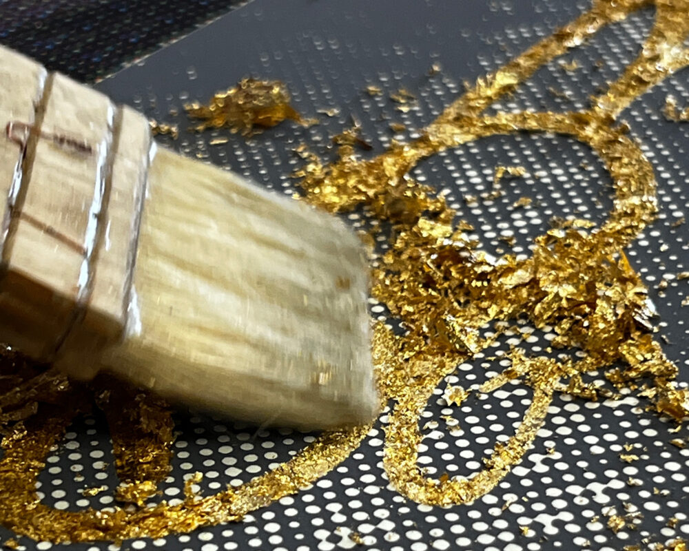
Slowly and carefully the image is revealed as a beautiful gold rendering!
-
-
-
-
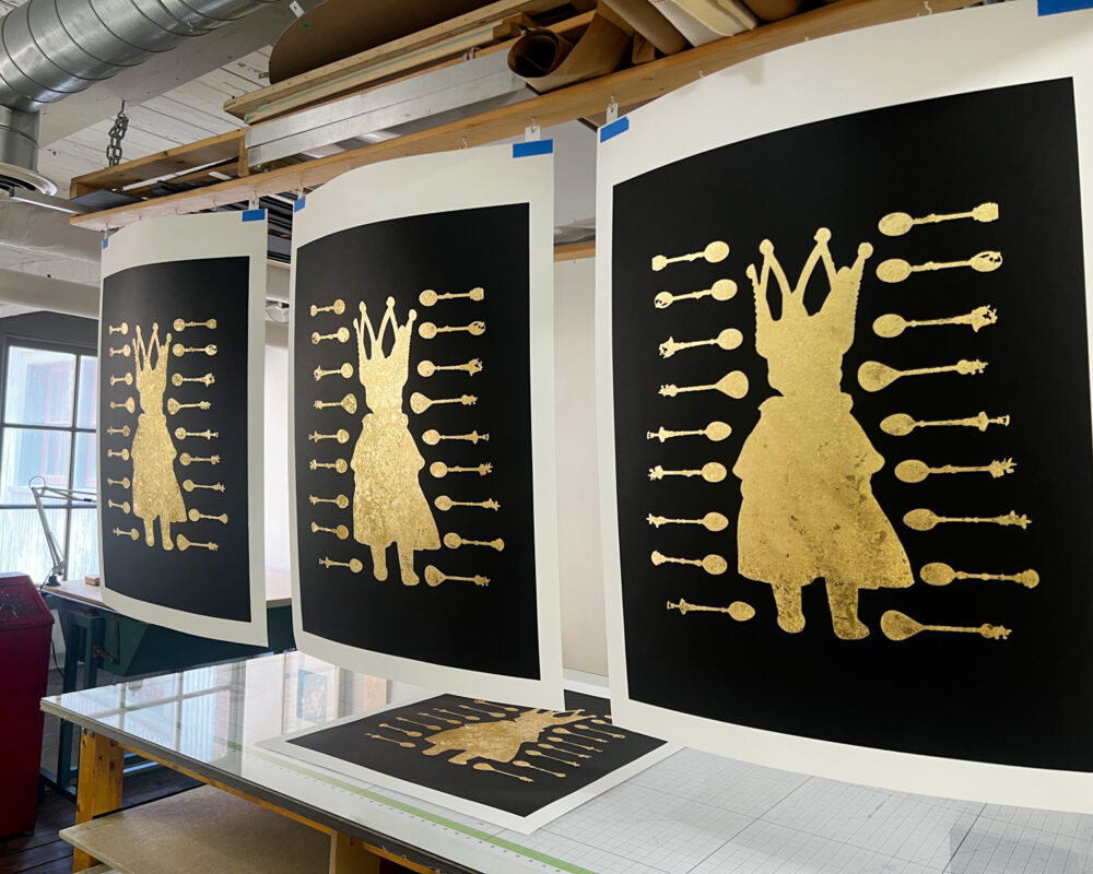
After time and care of applying the gold flake and gentle brushing and burnishing we arrive at a finish that plays with light and texture in really exciting ways and is unlike conventional ink application.
-
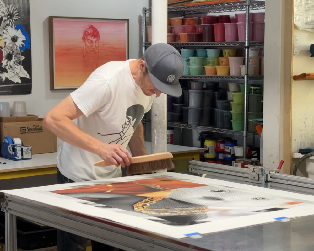
And of course when all is said and done, there's the final care to make sure that these works of art are trimmed, brushed, ready to show!
A few words with Roger Mooking...
-
Tara Westermann (TW): You have worked with Laine in the Smokestack studio with past projects. How was your experience working with Laine during the production of this project unique?
Roger Mooking (RM): Normally I come in with a very specific idea and / or completed pieces that Smokestack is printing for a gallery show. With Precious Metals we collaborated very closely at every stage. Together we were coming up with the idea for a collabo exhibition, naming the exhibition, discussing the themes we wanted to explore, mocking up the final pieces together and independently, how we wanted to present the pieces, how many pieces we would be producing and always texting our rawest ideas back and forth when we weren't able to be together. I'm so honoured he trusted me to share his moment for his very first contribution to Smokestack Gallery as an Artist in his own right, I cant express how humbled I am by that. We have established an extremely powerful shorthand with one another and seem to always land in the similar places as to when something is "finished."
-
TW: Were there any particular surprises or discoveries around the material processes engaged that stand out for you?
RM: I've played with gold leaf and dust previously in some of my own painting with acrylic on canvas but the gilding process was interesting when it was introduced to specific layers of a print. The combination of what I've learned, through Laine, about fine art printing and some of my usual practices was a really beautiful bridge. Also, one of my favourite takeaways was an image of a video we took where Laine is handing me a brush as we start to do the building of our collab piece "Feed The Beast". This image holds so much power to me and reminds me of the power of art to connect people from various walks of life, backgrounds and skillsets. This moment could never have been scripted and it is through the process of art making that it happened and luckily it was captured naturally.
-
TW: How are your interpretation(s) of the phrase 'Precious Metals" embodied in the works created?
RM: Well the obvious is the use of gold, silver and copper throughout and this was the spark as we began this exhibit with my producing pieces which feature gold heavily. Laine ran with this inspiration and leaned into the silver and copper theme visually, which rounded out the trifecta perfectly. Personally, I liken the commercial art market and selling of my art similar to the stock market in its wild evaluation proposition. I struggle with selling art and this is the first time I have ever sold any of my pieces outright beyond donating for auction. So the blend of the word "precious" and the notion of art as a commodity is a juxtaposition that is overwhelmingly prescient for me. Also, Ive featured children and their innocence heavily in my pieces as a way to illustrate something truly precious. So that balance of something truly precious (childhood innocence) against the commodification of another thing that I also hold as truly precious (art) is a large part of the narrative for me. In "Butta Baby" there is an unidentifiable royal silhouette who is being watched secretly, this sums up so much of how I feel about all of the ideas I'm trying to illustrate. These pieces are also personal in that these dolls are toys my wife used to play with as a child, so connecting all of these ideas together is extremely personal and revealing.
-
RogerMooking_SmokestackStudioResidency_2026_BTS14
-
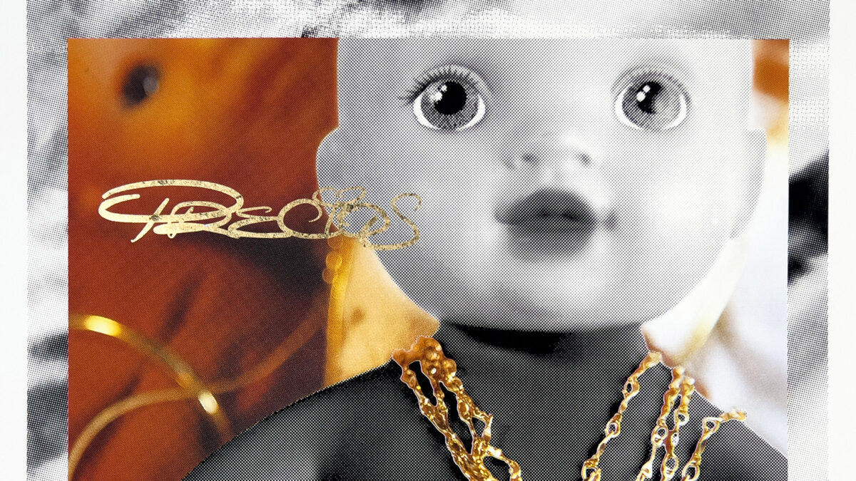
Roger Mooking - Golden Child
-
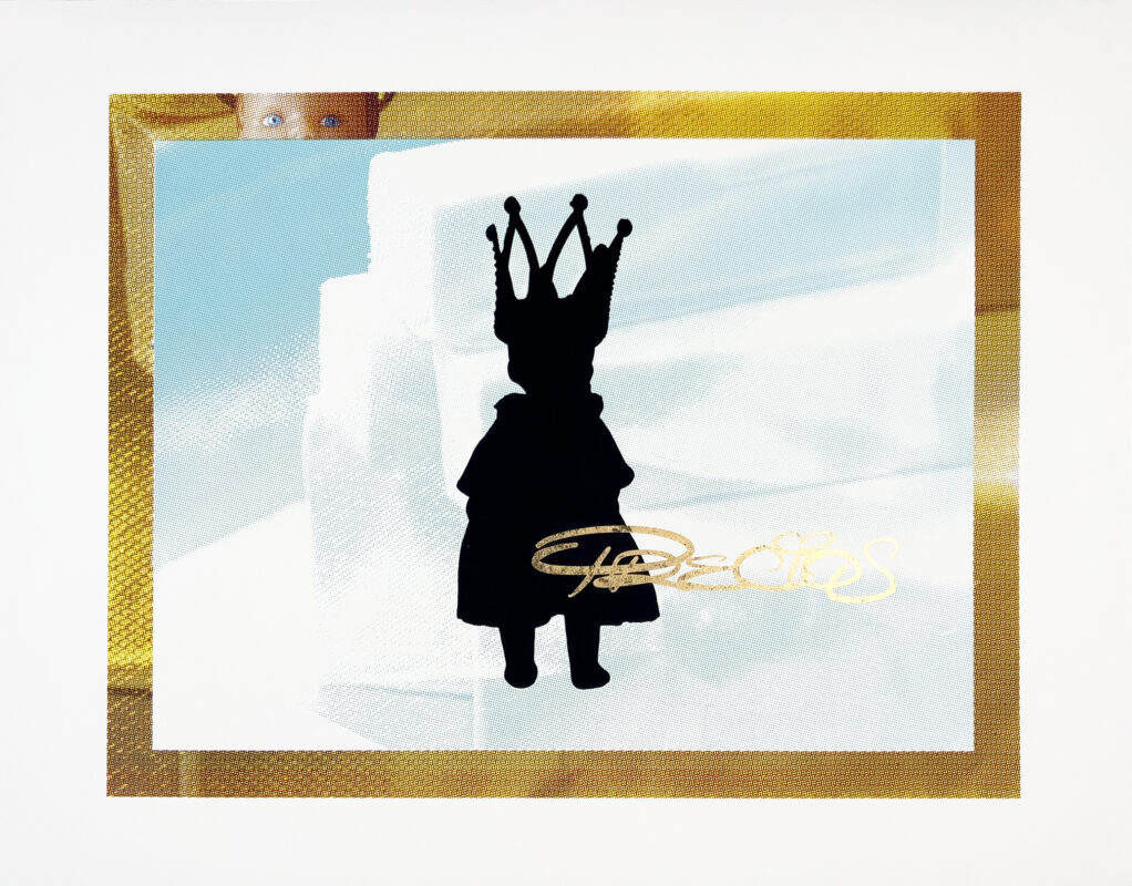
Roger Mooking – Butta Baby
- Silkscreen with gold-leaf
- Edition of 3
- 36" x 46" (image size: 30" x 40")
- 2026
$2,500.00
-
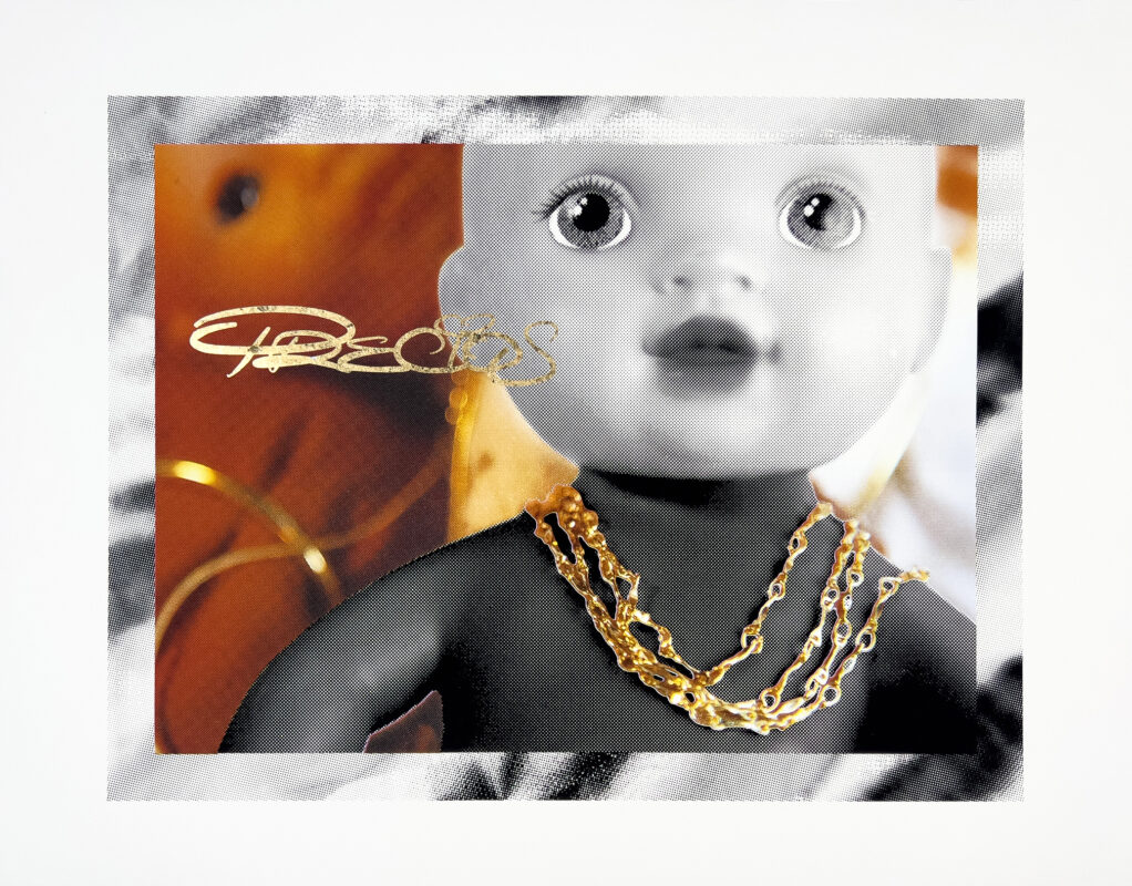
Roger Mooking – Golden Child
- Silkscreen with gold-leaf
- Edition of 3
- 36" x 46" (image size: 30" x 40")
- 2026
$2,500.00
-
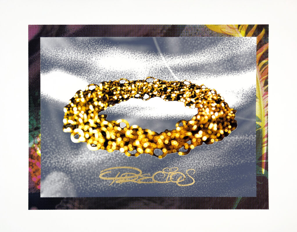
Roger Mooking – Holy Smokes
- Silkscreen with gold-leaf
- Edition of 3
- 36" x 46" (image size: 30" x 40")
- 2026
$2,500.00
-
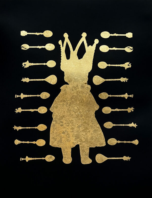
Roger Mooking & Laine Groeneweg – Feed the Beast
- Silkscreen with gold-leaf
- Edition of 8
- 32" x 25"
- 2026
$1,200.00
This project was made possible with support from: