Ver Sands
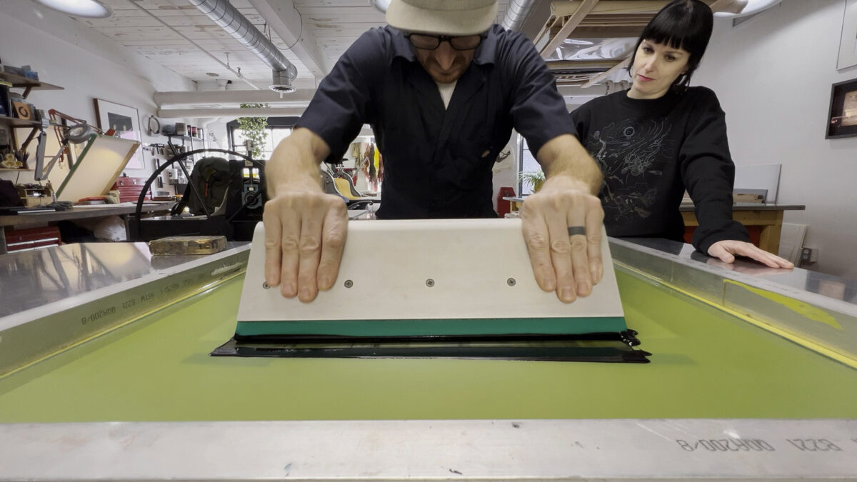
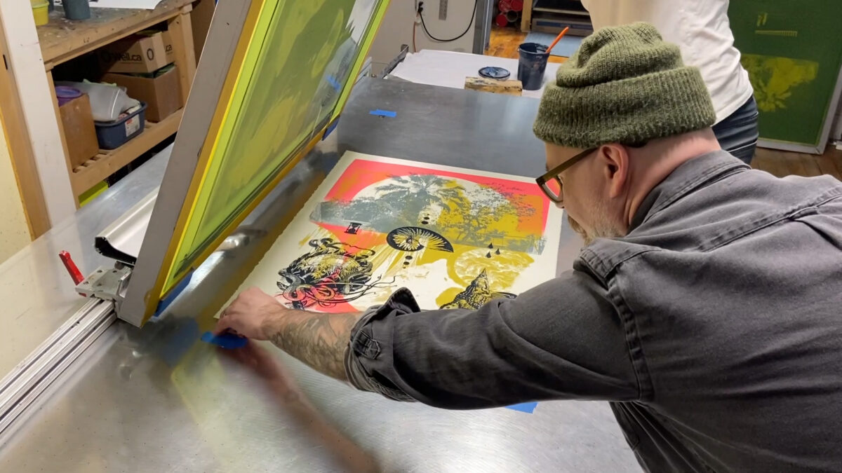
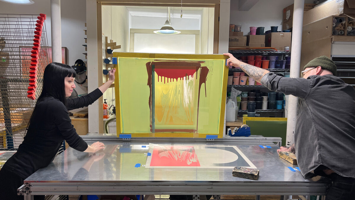
As Ver Sands, artists Jacqui Oakley and Jamie Lawson have produced a broad range of projects that merge the artistic disciplines of design, illustration, fine-art, commercial work, murals and live art. Challenged with the creation of a new body of print-work in residence with Smokestack’s analog printmaker, Laine Groeneweg, Ver Sands engaged their unique visual style in the printing of a silkscreen series. Representing the latest silkscreen-based works produced with Smokestack, their residency experience supported a varied experimentation with colour, imagery, and multi-media integration.
A few words with Ver Sands...
-
Smokestack Gallery Director, Tara Westermann (TW): You have been working collaboratively together for many years – professionally since the inauguration of Ver Sands, but fundamentally longer than that in many ways! In the case of this project, how were your respective areas of interest & professional focus(es) integrated through its making?
Ver Sands (VS): We always find the beginning of a collaborative project exciting but also challenging, in a good way. We’re excited by the opportunity to make something together but we want both our voices and current interests to be accounted for, and finding that balance can take a lot of brainstorming. As we’ve been hitting middle age both of us have been looking back to what has brought us to this moment; both of our individual practices have evolved independently, and it’s a process to relocate some paths to investigate together. But the process always results in something new and exciting for both of us and that’s why we love working together.
It was really good timing for us to have this project arise. We had discussed some of the ideas behind See/Saw previously, even outside of an artistic context. Exploring memory, history, location, loss and dislocation… these are things that we share an interest in. Even just thinking about media from our childhood and formative years - old movies and posters and books and music... See / Saw became a chance to kind of jump into this shared universe of influences and references that we have and to work through some of the loses and special moments in our lives. These thoughts really directed the way we worked on the project, helping us to determine the landscape within which we’d be playing.
-
TW: What is it about memory that has captured your interest to explore in this project? Are there particular memories that you're drawing from? E.g. From a particular time? Experienced together or independently?
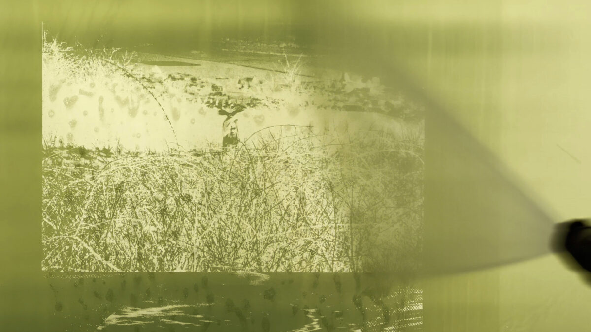
VS: We’re both very nostalgic people. Jacqui had a highly mobile childhood having lived in several different countries across the UK, Africa, and the Middle East before the age of 11 when she moved to Canada. Jamie’s upbringing was in Ontario suburbia, but with an attachment to England via his mum and her family. A lot of this work was from our childhood photographs, often close to water or trees in our various childhood landscapes and spanning different seasons.
An interesting thing that we noticed toward the end of the process of producing this body of work is that we each relate differently to the pieces that we’ve created. For Jacqui the images are evocative of a place and time, bringing forth rich sense memories and recollections of very specific experiences. Jamie on the other hand, has more distanced associations with the images, not always remembering these moments of his past, but still having an emotional response nonetheless. The process has brought up questions of what memory is and how it has been integrated into our lives. Once we recall things in our brain they change and evolve. These images are impacted by stories from our family and the narrative can change, but does that make them any less impactful and important?
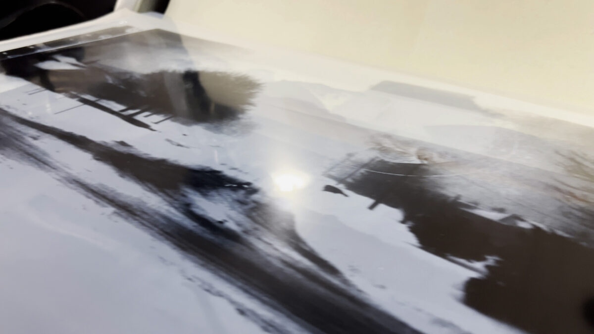
In “Home by the Sea” we used a photo of Jacqui’s home in Bahrain. A house that probably was demolished and in a country that has vastly changed over the decades. It brings up a deep homesickness for a place that doesn’t exist anymore. Jamie’s photos can be seen in “The Sands” of him and his brother walking along a beach in the UK, a memory he doesn’t recall but never-the-less fills him with emotion. “Cascade”, a photo found randomly in a photo album that no one in his family remembers but its mystery is evocative. “Boreas” is an image of his childhood home in Burlington one frosty winter. Then lastly, “Down the Street, Through the Brambles” are photos of both of us as children. Jacqui, in Zambia and Jamie in the UK. It makes us wonder who we were back then, what led us together and to think of our own child’s life. Thinking about the constant movement of identity, the concept of home and memory all comes to play in these pieces.
-
TW: Working collaboratively, how were the images planned/designed/prepared for translation into print?
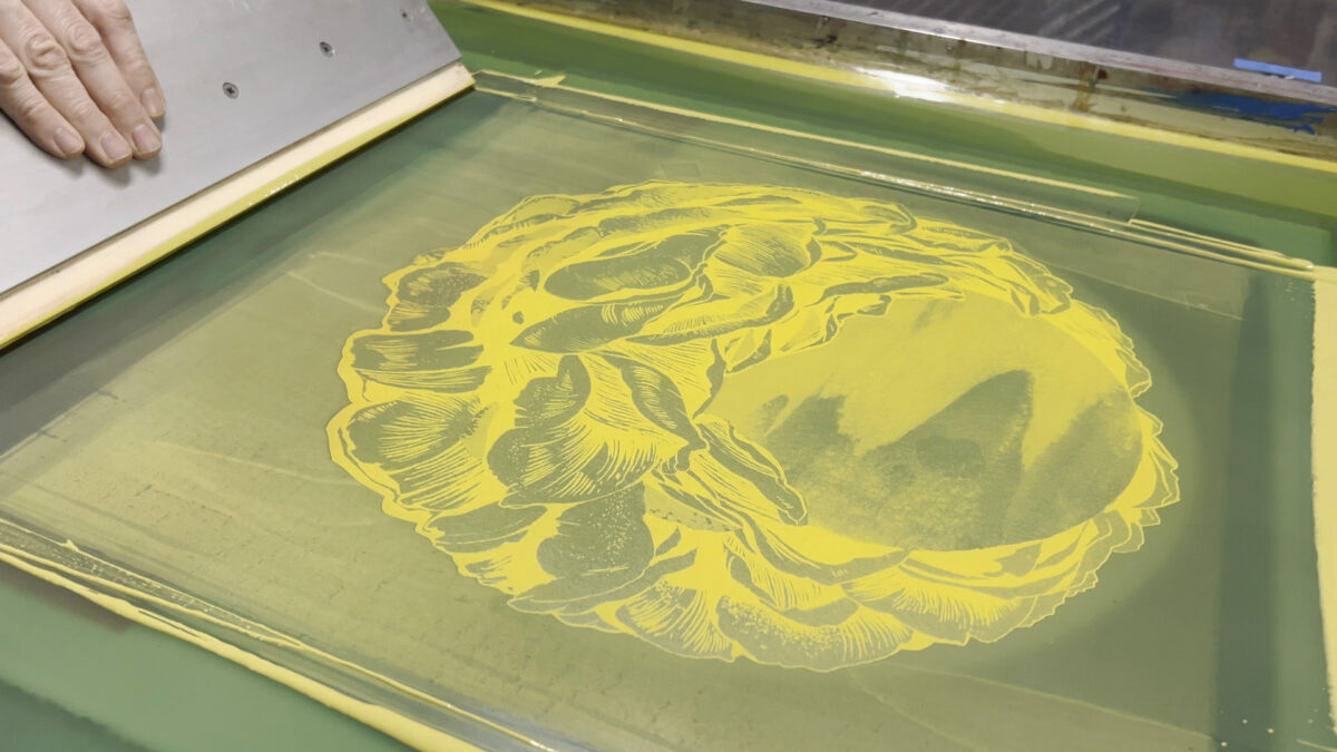
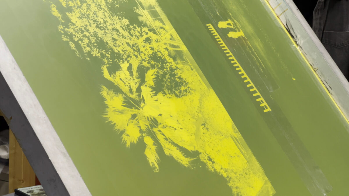
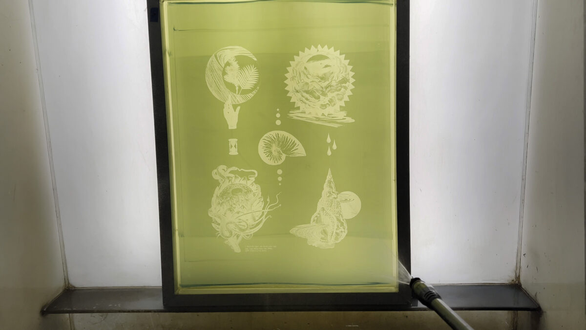
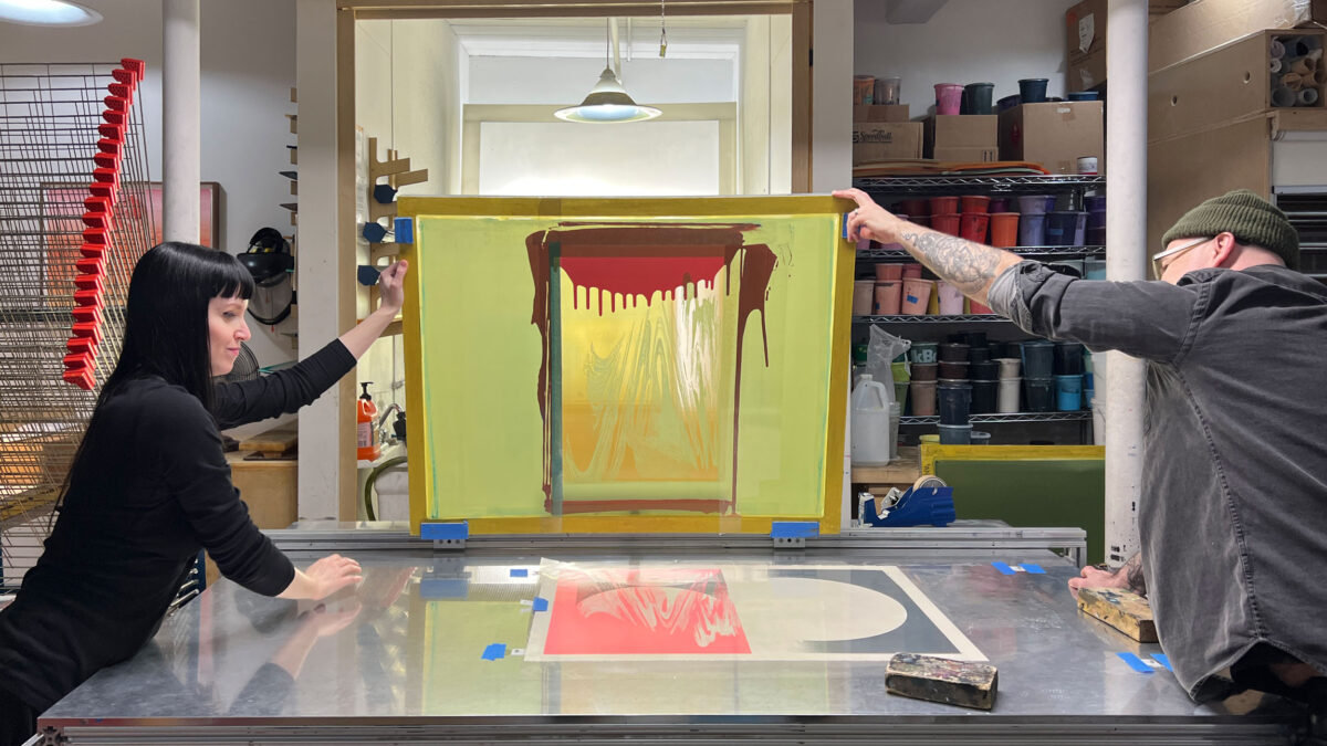
Having our theme in mind, we searched through family albums, and found images that meant something to us, or had an interesting atmosphere. We gathered these photographs and material from our family archives, scanned them and then started playing, considering forms and shapes that would further our ideas. Jacqui worked with inked artwork of flowing lines. This was evocative of literal elements of water and air but also symbolic of movement and the ethereality of memory. Flower artwork also was connected to memories of landscapes of various countries, and the ever present sun was also an important element to include. Jamie combines these in the digital space playing with the elements in a sort of spontaneous loose way, adding textural and graphic components before handing back to Jacqui who in turn played with the composition. This back-and-forth process is always interesting. Seeing what the other person does and then jumping off from it, and it pushes us to think differently and experiment more.
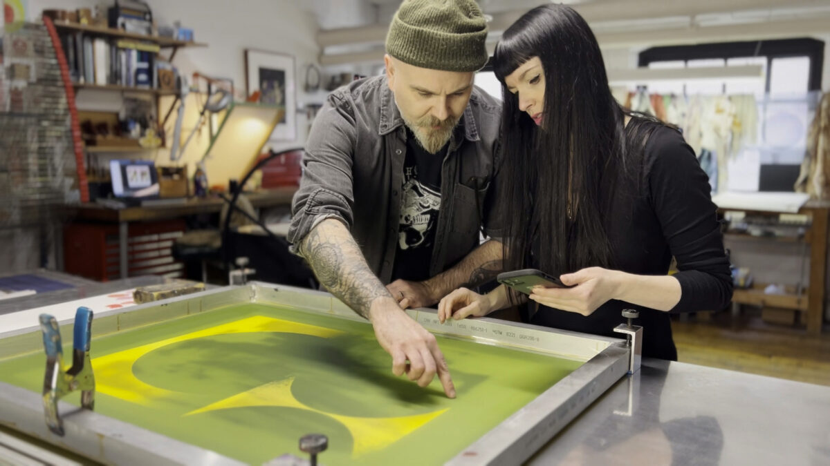
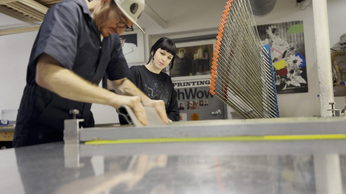
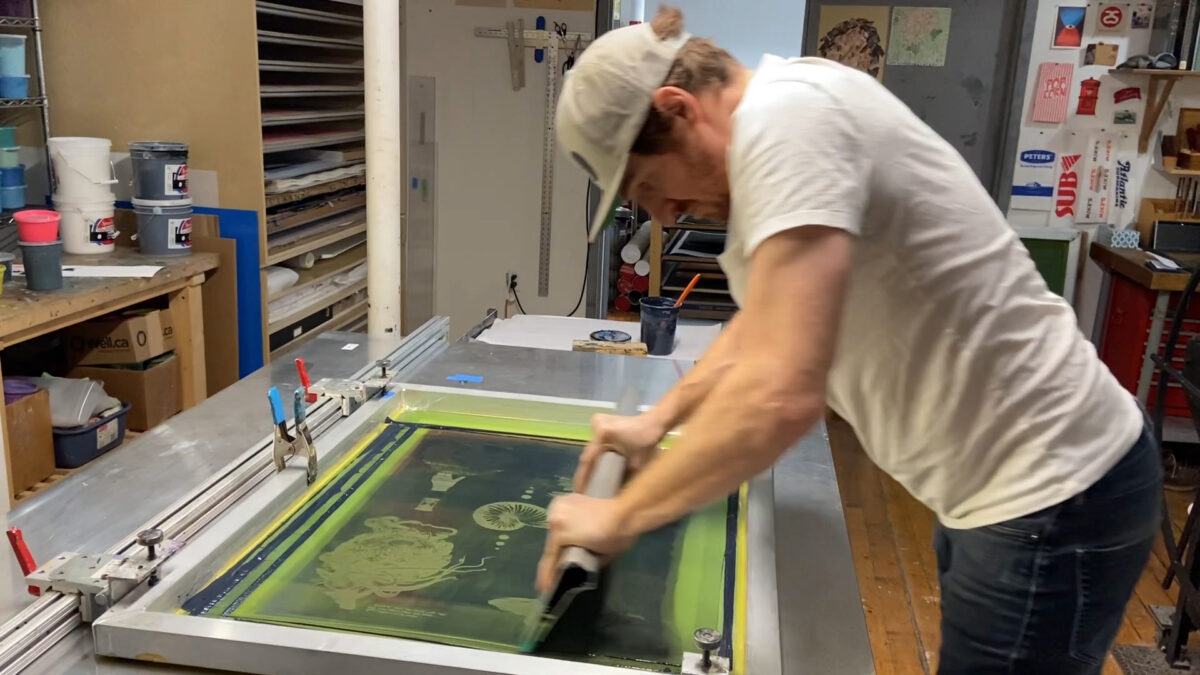
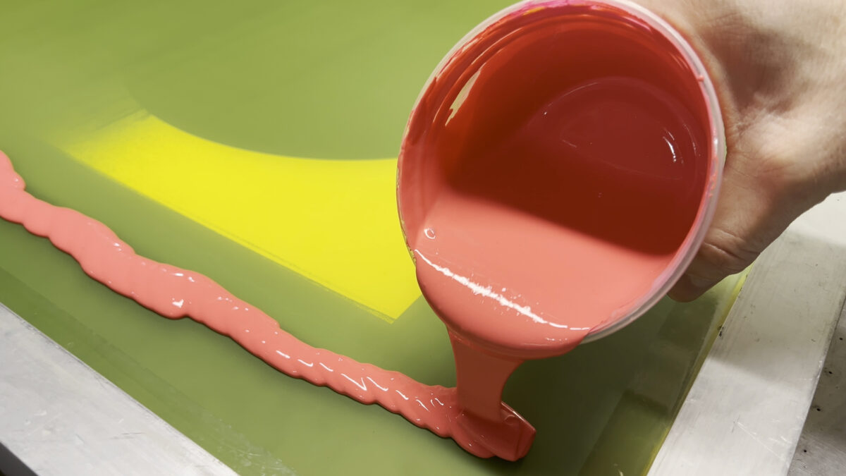
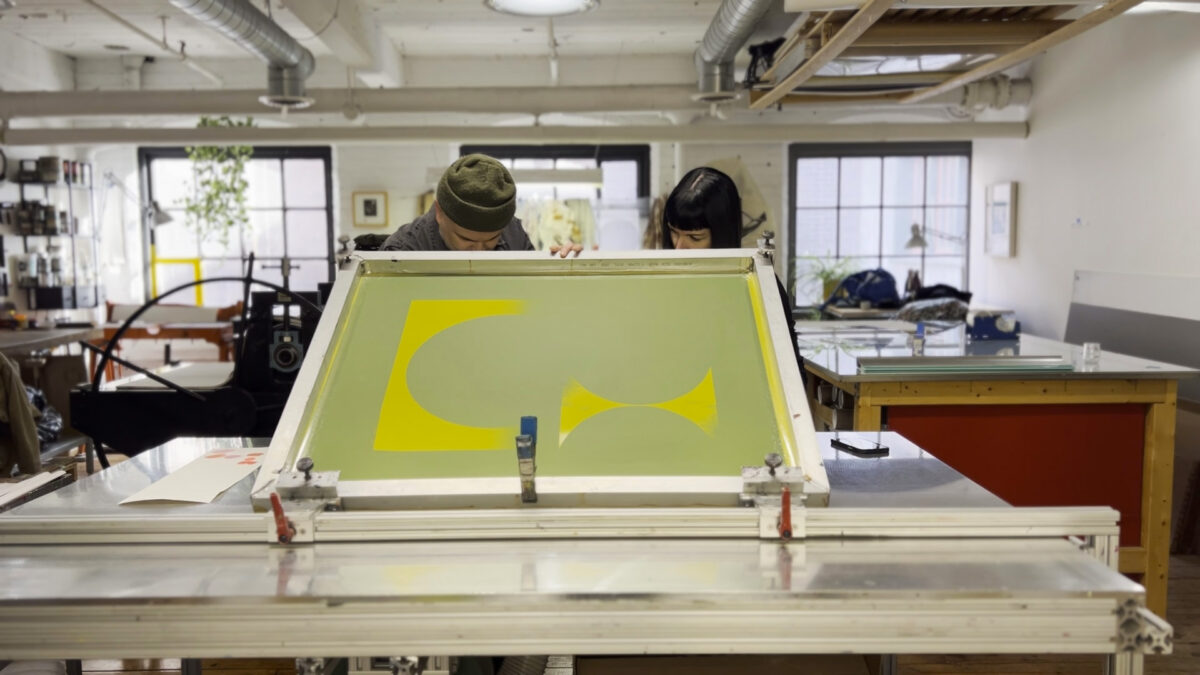
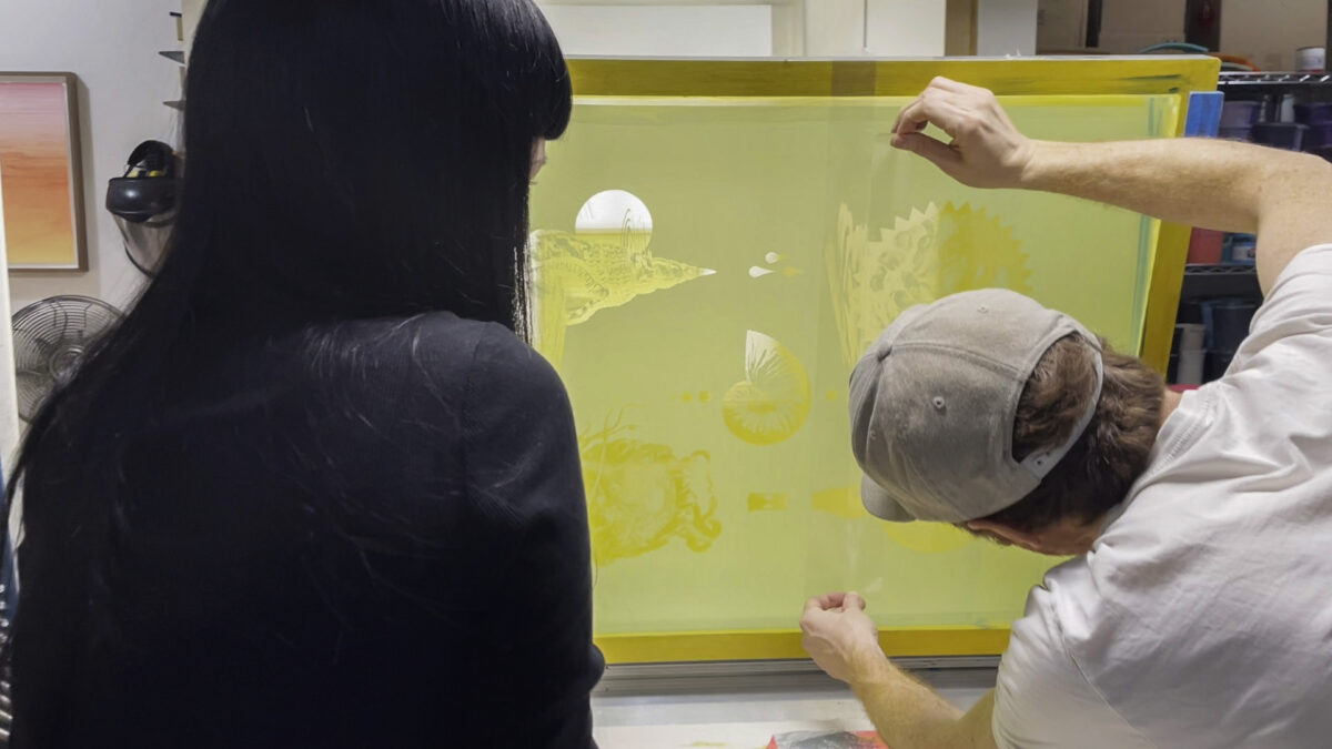
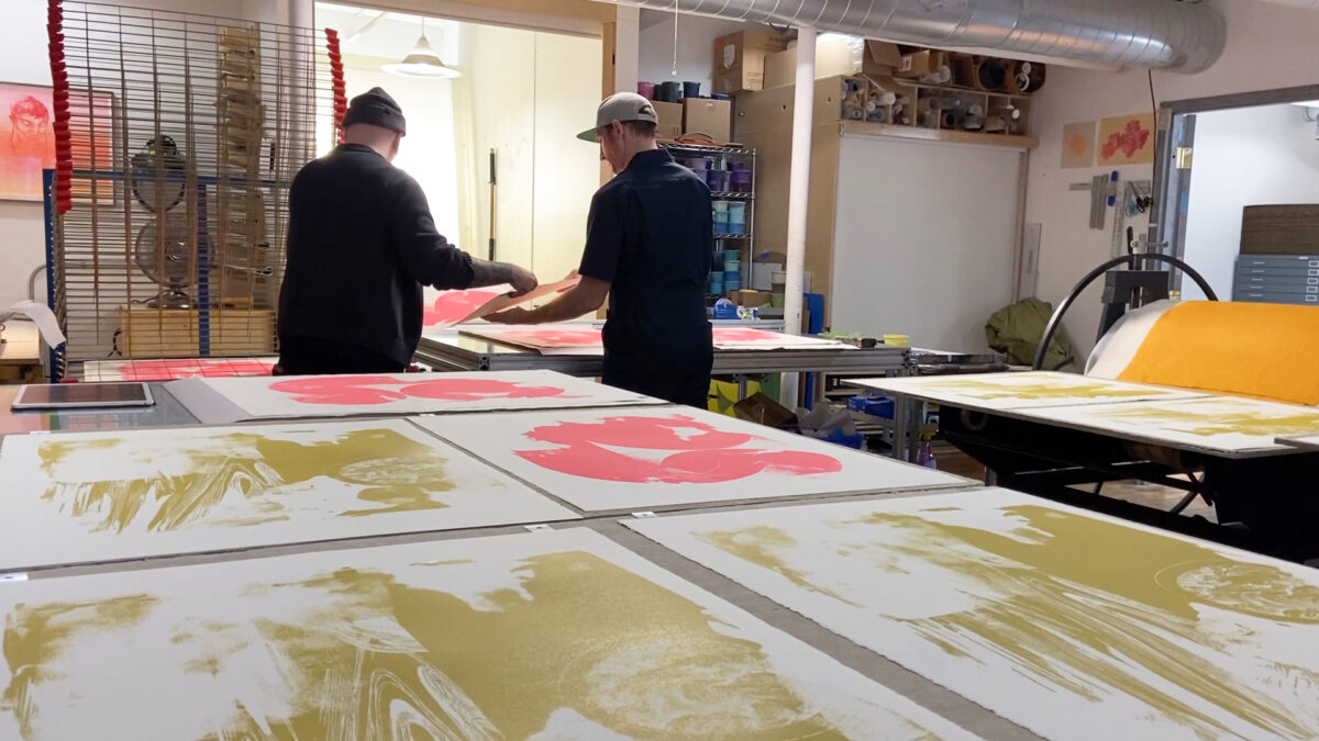
Following this, moving to Smokestack to silkscreen the pieces, working with the incredible Laine, in turn adds another interesting variant. Seeing how the colours combine; figuring out how to layer the screens and what that effect will be.
-
TW: There’s an integration of representational/illustrative elements with abstracted design across the series. What influenced your decisions around how to express your imagery
VS: This is a balance we often like to play with — abstraction and representation. We knew we didn’t want the photographs to just stand on their own; that it was more interesting to combine them with one another and/or to apply additional illustrated or graphic elements. Conceptually we knew this merging had the potential to enhance the emotional aspect of the images, and compositionally we felt we could amplify these aspects using that contrast between representation and abstraction. We both like to use geometry and negative space, so bringing in not just the illustrated pieces, but these other shapes and textures helped to build compositions as a sort of pathway into the photos that wasn’t so literal. Some of the pieces share sort of a “horizon” in a way, and we like the idea of this kind of shared vocabulary even though the source material was so different.
-
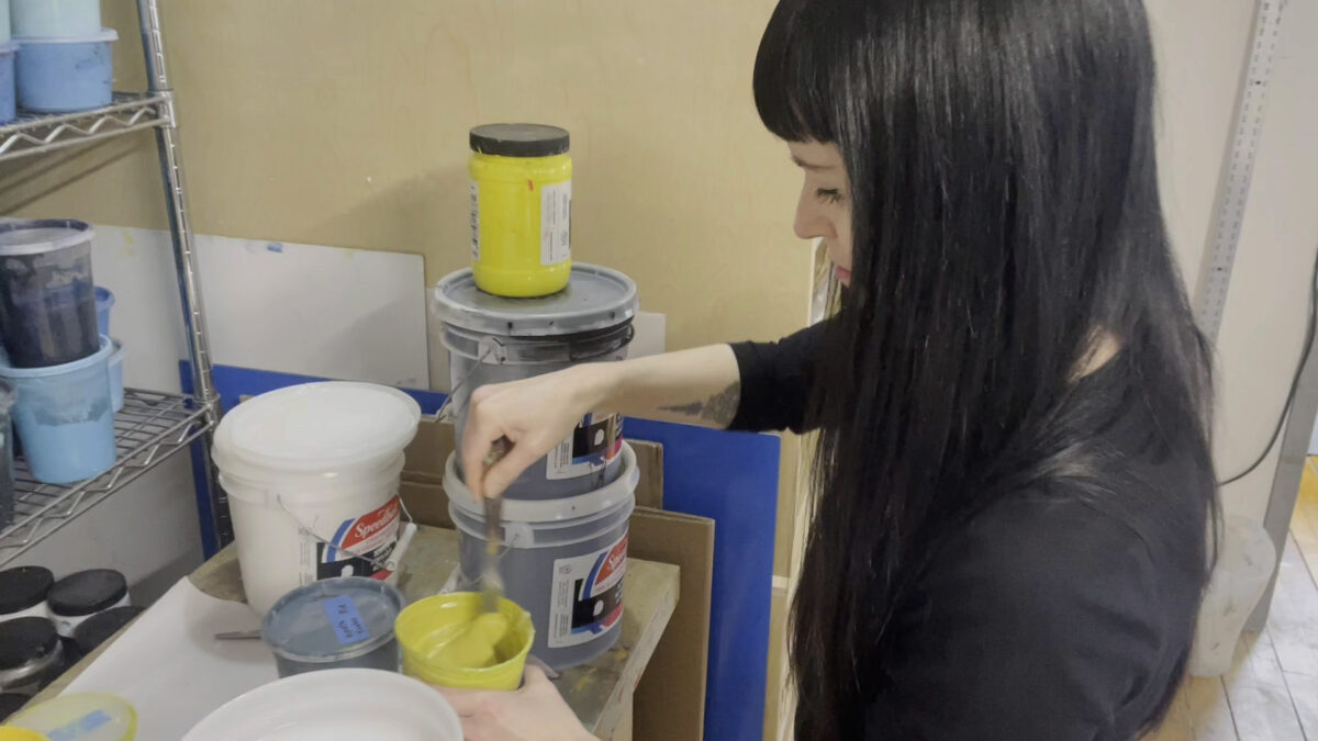
TW: There’s a fairly limited – but bold - colour palette weaving through this project. What role does colour play for you?
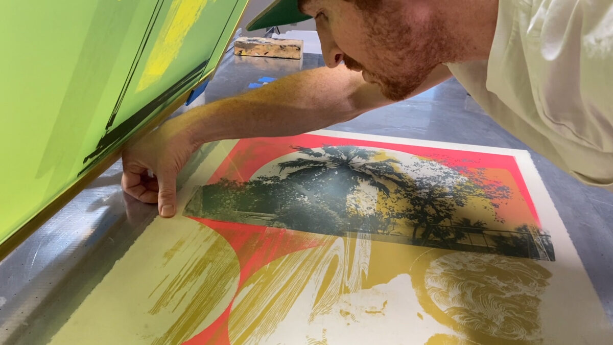
VS: In both our individual and collaborative work we like to use bright palettes. With these pieces, we originally had a more subtle palette in mind, but once we started mixing colour we couldn’t resist making the lighter pink more into a hot pink. On Laine’s suggestion, the black turned more into a dark blue which added such a lovely depth. I guess we just can’t help ourselves. But even with the brighter colours we wanted a feeling of ethereality and we hope the art conveys that. Limiting ourselves to just a small palette also helped to unify the pieces, and to weave a thread between them, echoing how our themes unite the works.
-
TW: Since Ver Sands was inaugurated, you’ve worked collaboratively on a number of print projects – with Laine at Smokestack too. How did you feel the collaborative production process of this series compare with previous projects?
VS: For our first foray into silkscreen printing with Laine in 2017, we had multiple screens that we played with during the process, not quite knowing what the final design would be. Each screen has one graphic or drawing that we combined, recombined, and layered in different ways. This brought interesting and surprising results, but we wanted to be a bit more direct this time around. Understanding the medium more now, we pre-planned the compositions which allowed for a nice repetition in the horizon lines and various design elements. For this new body of work, we felt it was important to be purposeful and properly convey the emotions of each piece and to cover all our concepts. Both routes are interesting in their own right. Maybe the third time we’ll find a way to combine both these approaches.
With both experiences, Laine‘s influence was a constant — as a helpful guiding hand not only in the technical process, but also introducing new suggestions, and of course lending his kind enthusiasm. The Exhibition Edition (“Echoes”) is an especially good example of all of us coming up with something after working on the main body of work. Laine really drove what he thought was going to be a really great, distinctive representation of what we were all working on.
-
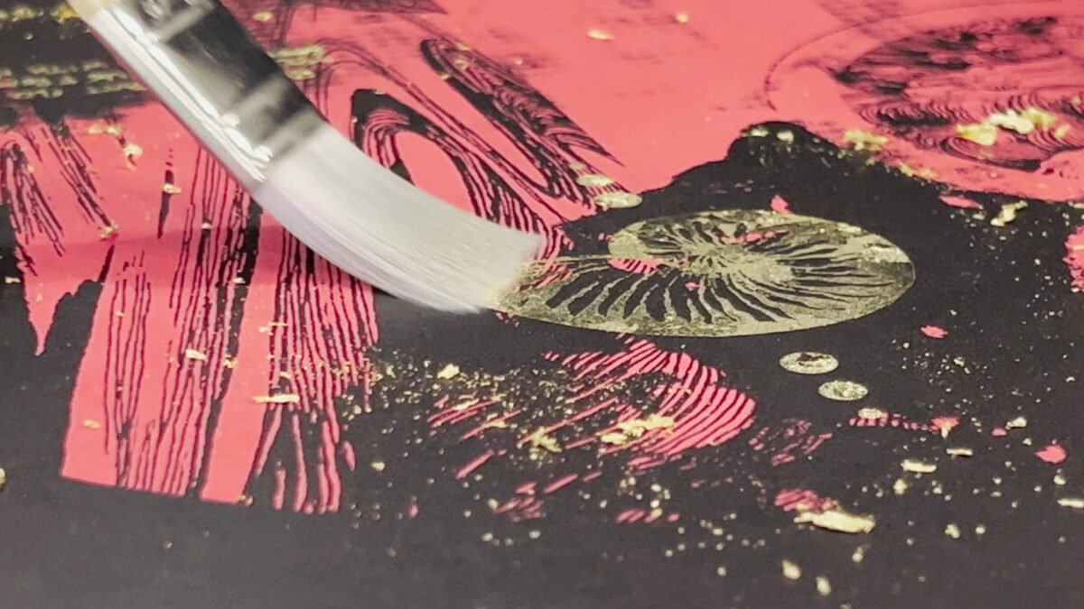
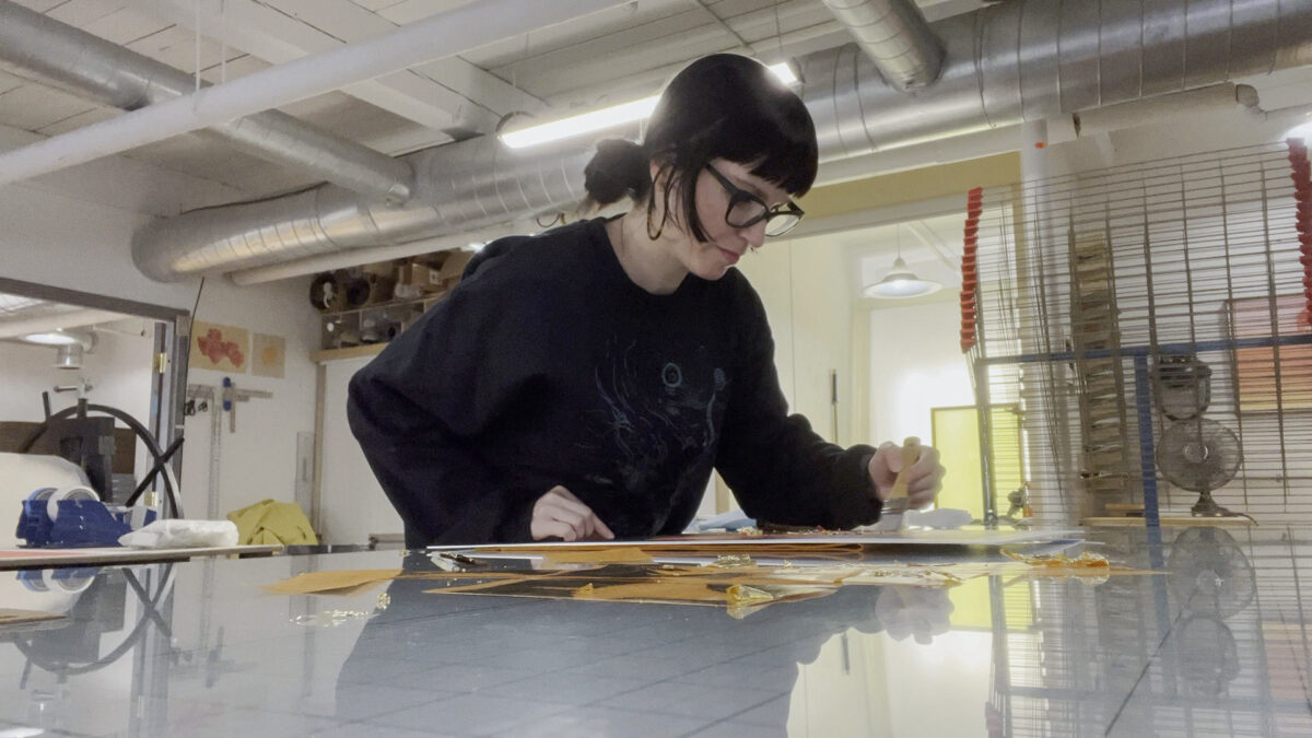
TW: Any surprises? Exciting new experimentations? (I do know there was some gilding involved)
VS: What we love about working with Laine, and with silkscreen printing in general is that as much as we can design an image, there’s always beautiful interactions between the layers that are unexpected. The way the colours work off each other and even mixing the colour itself can change the whole atmosphere of a piece.
When Laine brought up the idea of the Exhibition Edition and that we could do something special with it, gilding was something that leaped into our minds. Even though we enjoy the multiplicity in printmaking it is interesting to make each piece more unique and gilding does that. Since it’s such a physical process, each piece is unique which compliments the whole theme of the show.
And of course the t-shirts were an interesting addition. That wasn’t planned at the start. As we were printing, certain themes and even the Machen quote itself became really integral. We thought it would be interesting to make a memento of the show which goes well with the theme of memories.
We think overall the surprise also comes from just how rewarding the process is with Smokestack. We always know it’ll be a great experience but we’re constantly moved at how exciting the process is and to be surprised by it all hung and the marvellous Hamilton community’s kind reactions.
-
TW: How did development and production of this project - as a personal endeavour – differ from your commercial work?
VS: With client work we have a box to work in which is dictated by the client and the audience. Boundaries provide the crucial structure, clarity, and focus needed for creativity to thrive. Decades of working in both graphic design and illustration have allowed us to discover our own voices within these bounds. With our personal work we have to establish these boundaries ourselves. Even though we’re free to explore anything, we always strive to make our own guides that will challenge us to push ourselves into new territories.
We think our years of practice in all these worlds has given us a unique perspective. We compose and pick colours like designers, but these art projects allow us to be more personal, which is often intimidating but rewarding in the end.
-
TW: There is a quote by Arthur Machen, a late 19th- early 20th century author and mystic, that is prominently integrated across this body of work. What is the significance of this reference?
VS: When we were invited to do this residency, we pondered various ideas before beginning anything. We knew the common thread between what we were invested with was the idea of memory and home. A nostalgia of types. At the dinner table we often talk about what we’re reading and Jamie kept bringing up quotes from the book The Three Impostors by Arthur Machen. The verses were poetic and abstract enough to invite an audience in, which is something we always aspire to do in our work. This verse “I believe that old places like this are like shells from the shore, ever echoing with noises” both struck us, and absolutely expressed what we were trying to accomplish with the visuals. It wasn’t too direct. It wasn’t too literal or explained. It seemed like a nice enigmatic, but poetic, way of capturing these ideas we were trying to convey. We also loved the image of children holding up a shell to hear the ocean. There’s a magic in that.
-
VerSands_SmokestackResidency_1
This project was made possible with support from:
