Tyler Bright Hilton
Tyler Bright Hilton has developed his narratively-focused professional artistic practice within the realm of printmaking. For over 10 years, he has worked exclusively with Smokestack’s analog printmaker, Laine Groeneweg, in the creation of an expansive series of etchings and so their established working relationship to-date provided an apt foundation for experimentation with a new discipline through Hilton’s 2024 Smokestack Analog Printmaking Residency. With the intention to utilize a broader range of tools and mark-making, the direct-to-plate method of photopolymer gravure offered exciting new territory for Hilton’s imagery expression.
-
During his residency at Smokestack, Tyler wanted to explore the possibilities of using photopolymer gravure plates in conjunction with hand-painted and hand-drawn films. This small test would become the root from which we would begin to develop an entire technical approach to making prints in this way.
-
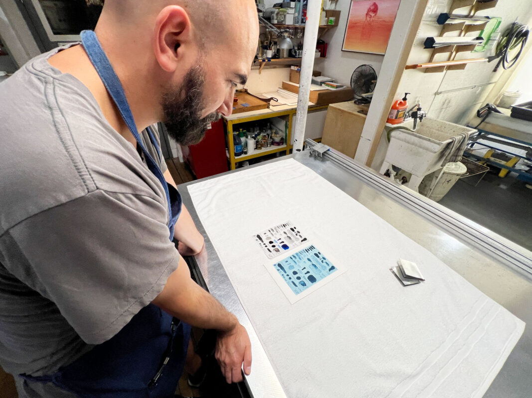
The very first step of anything new is to do a little testing! Tyler & Laine dove right in and did just that by developing a small chart of marks using various drawing mediums that would be translated into photopolymer gravure. This included such things as acrylic ink, pencil crayon, and granulation medium to name a few. Ultimately, this would also be a starting point for learning about exposure and development times in the plate making process.
-
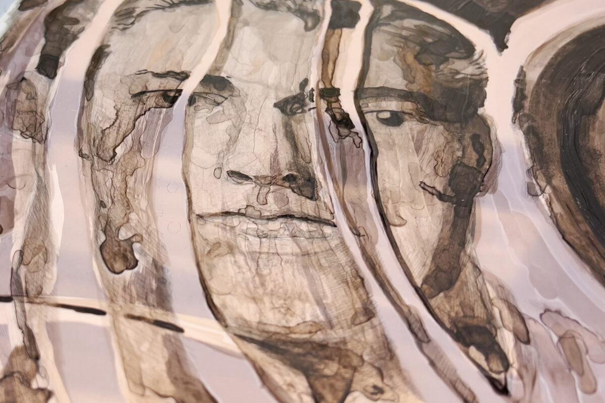
In the initial stages of testing the direct-to-film process, Tyler & Laine explored the use of many types of transparent and semi-transparent materials. It became clear through that testing that certain materials offered less interference with the exposure of the plates, while others presented better supports for mark making. Finding that ideal balance was definitely a big challenge in the initial stages of trying to find out what was the best route to go with a direct-to-film approach.
-
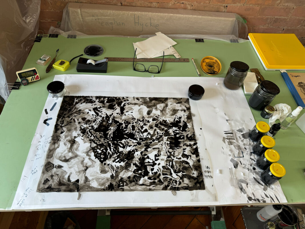
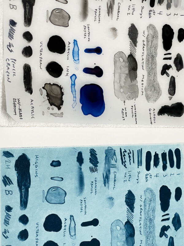
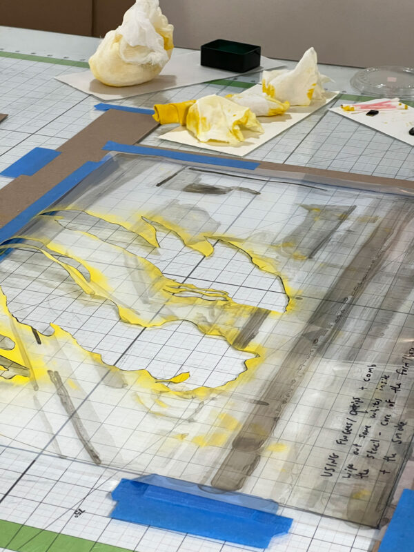
During this time, Tyler focused deeply on finding cocktails of ink formulas that would respond well to the delicate film surface. Because the surface of the film was so receptive to aqueous solutions, it was a big challenge to determine how to arrive at a formula with would allow for smooth manipulation and build-up of ink. The end result...a vast array of tone, washes, and gestural marks!
-
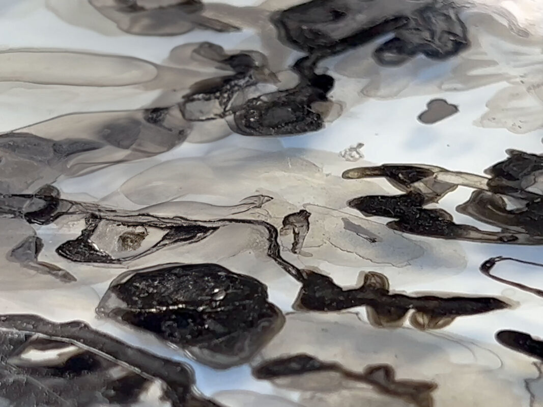
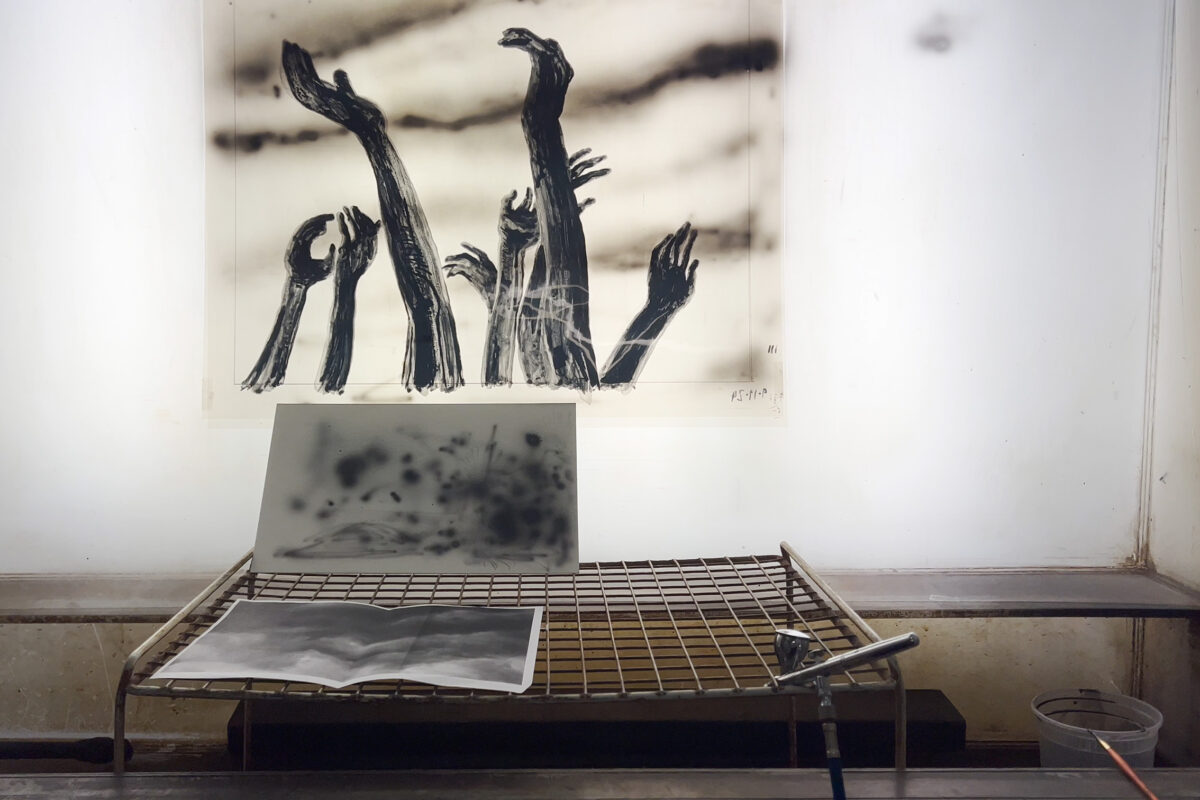
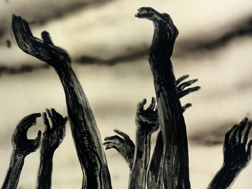
Seen here is a close-up of just some of those marks that were imparted on the surface of the film. Because the film ultimately became thick with ink build-up it also required us to consider how that would affect contact with the plate (or lack thereof) in the exposure stages of the process.
-
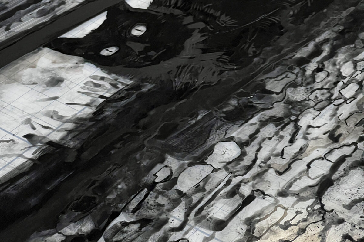
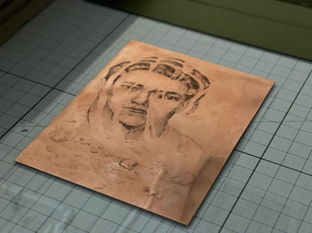
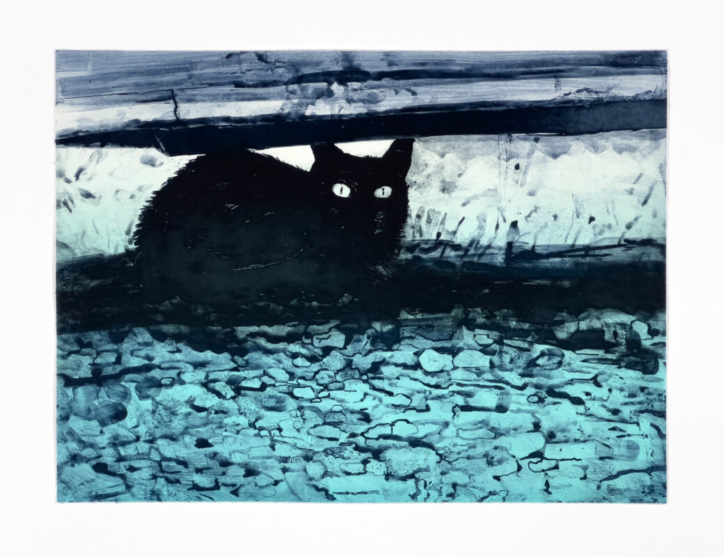
Based on a much smaller etching that Tyler created, his image making on film began with a reinterpretation of this cat. It not only gave him a familiar place to begin working with a new method of image preparation, but also allowed for new ways of mark making and material exploration.
-
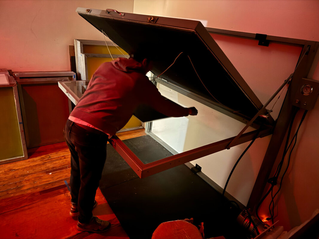
With all photo-based processes the darkroom always plays a pivotal roll. Using a large format exposure unit, the hand-painted films were exposed to photo-sensitive polymer plates using UV light. In this stage of the process we spent many hours testing various exposure times as well as troubleshooting various translations between the image on the film and what was being resolved on the plate. If only it was a matter of "set it and forget it"... but alas, it was not!
-
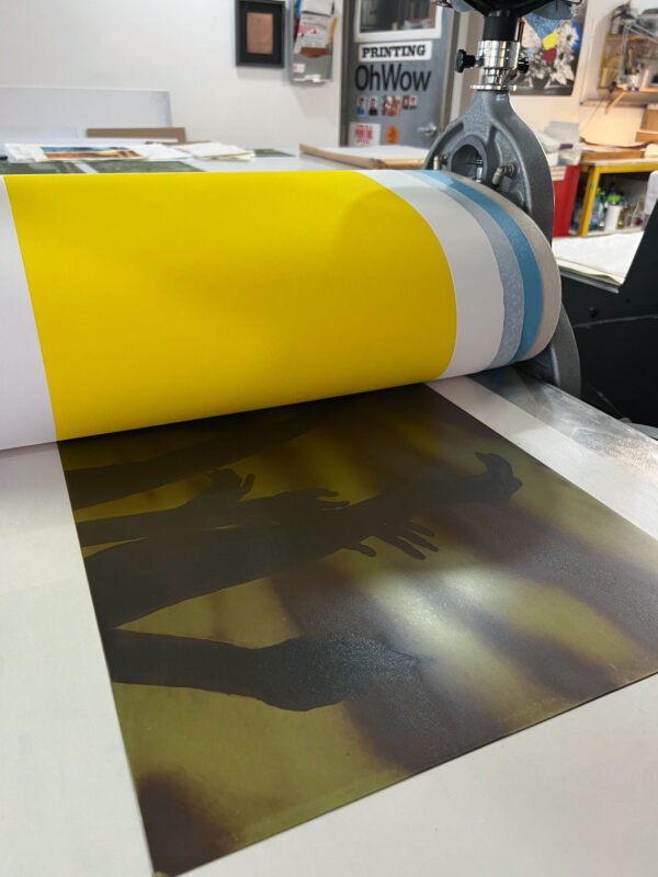
Directly after the polymer plate is developed it needs to be squeegeed to remove the heavy excess of water.
-
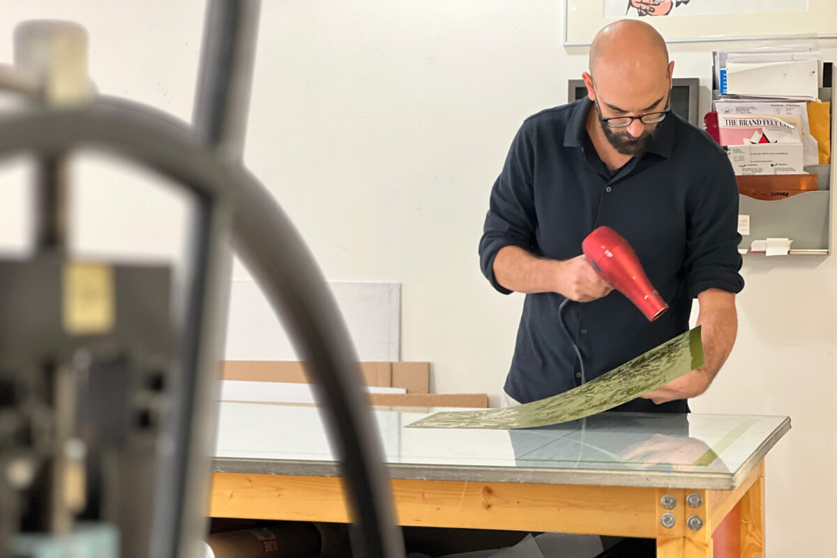
Seen here, Tyler quickly dries the surface of the polymer plate in order to remove moisture from the surface after development. Leaving excess water drops or moisture in the plate can affect the image within the surface of the plate and therefore it's important to dry it as quickly and thoroughly as possible.
-
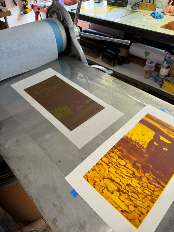
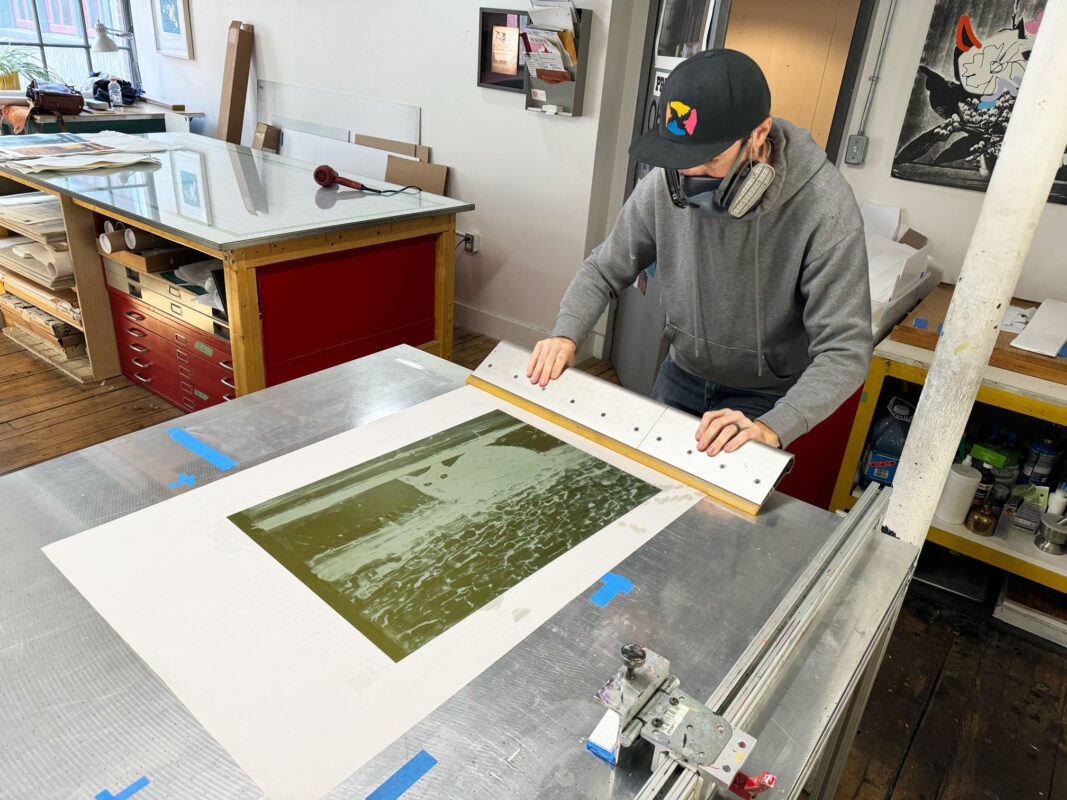
Early stages of printing each plate began with some basic colour testing. We used a smaller image plate to get a general idea of colour palettes before jumping into larger scale images which require far more ink. This was a great way to reduce resources and move a little quicker as we were trying out different options.
-
For those unfamiliar with the process of printing intaglio plates, ink is applied to the surface of the plate and subsequently wiped off to leave a residual amount of ink embedded in the surface of the plate where the image areas are.
-
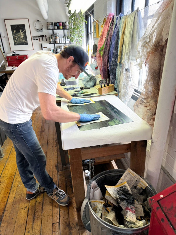
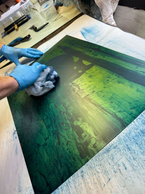
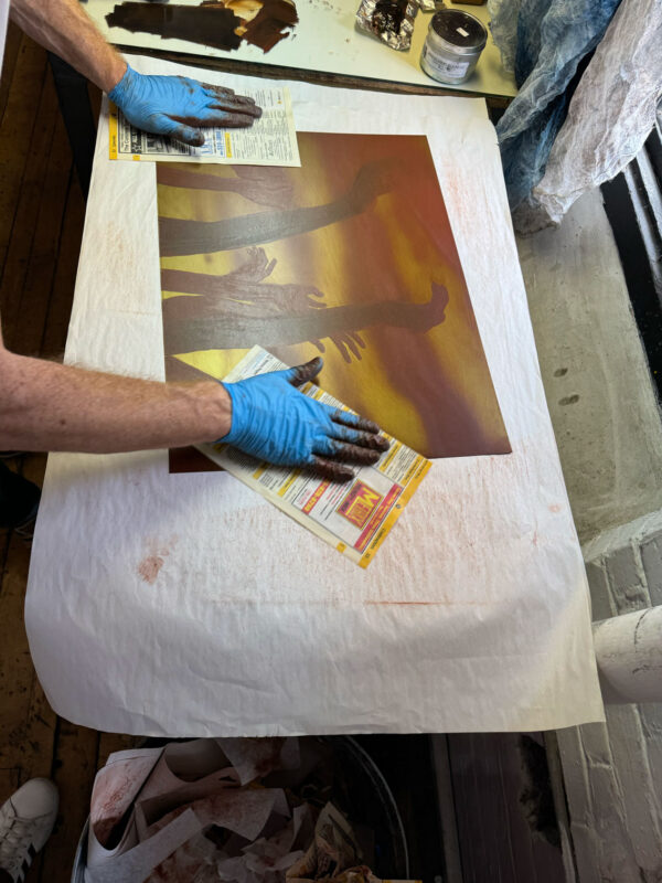
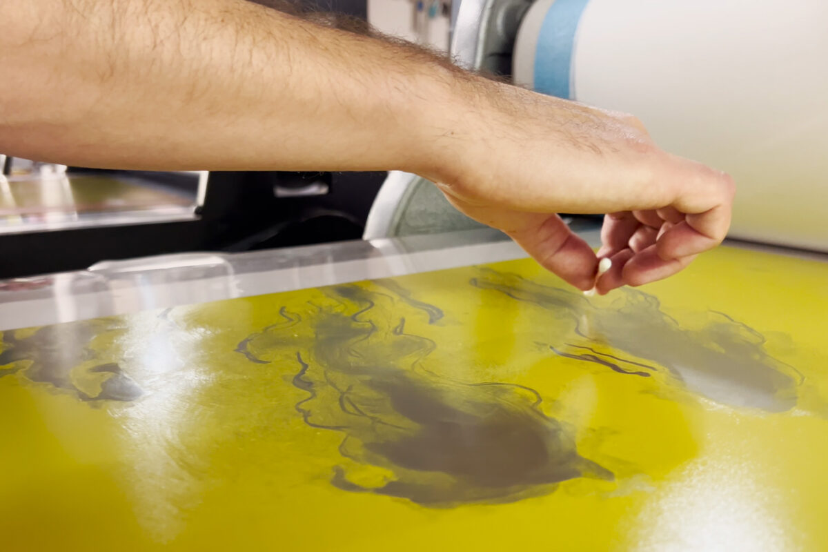
One by one, plates are inked and wiped by hand. This often involves soft tarletan cloths, newsprint, and tissue paper. Ink is gradually and delicately pulled from the surface of the plate using any number of these methods. The application can be simple and straight-forward, or can be very complex as more and more colours are introduced on the surface of the plate.
-
In many cases throughout Tyler's residency, plates employed multiple colours that were simultaneously applied to a single plate surface. This made for more complicated wiping strategies, but garnered beautiful and exciting results!
-
Leaning into years of working together in the studio and previous colour explorations, Tyler & Laine utilized viscosity printing to achieve some of the colour work with these plates. Creating different viscosities in the inks allows for inks to either mix or repel - just like oil and water. This was leveraged to simultaneously have some colours flow into each other while others would stay separated.
-
With the use of various applications of ink in the actual printing stage of the process, we were able to start seeing Tyler's images in new ways that were really exciting!
-
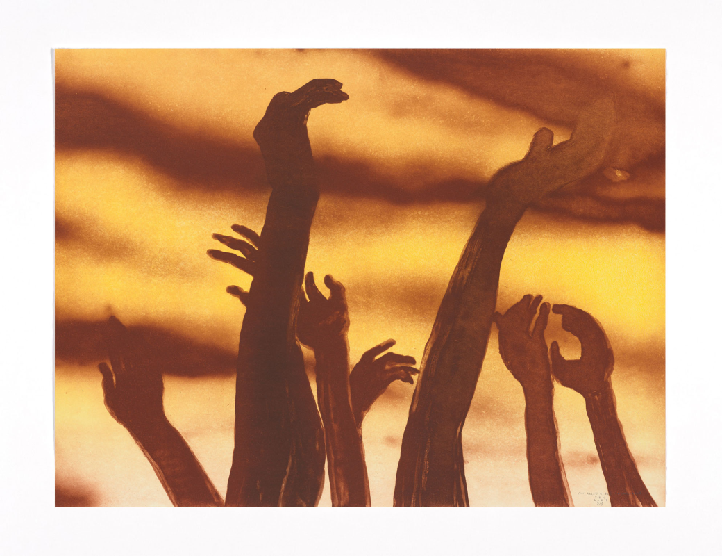
In many of the films Tyler employed direct brushwork and manipulation of acrylic-based ink to achieve his imagery. In other cases he moved away from the standard bristle brushes and opted for tools such as the airbrush to give softer effects and graduated tones.
-
Along the way Tyler & Laine started talking about the possibilities of using multiple films to create a single plate image. This was achieved by stacking films during the painting process... not unlike cells in animated movies. Using this technique gave much more flexibility and control in the way image layers were conceived and executed.
-
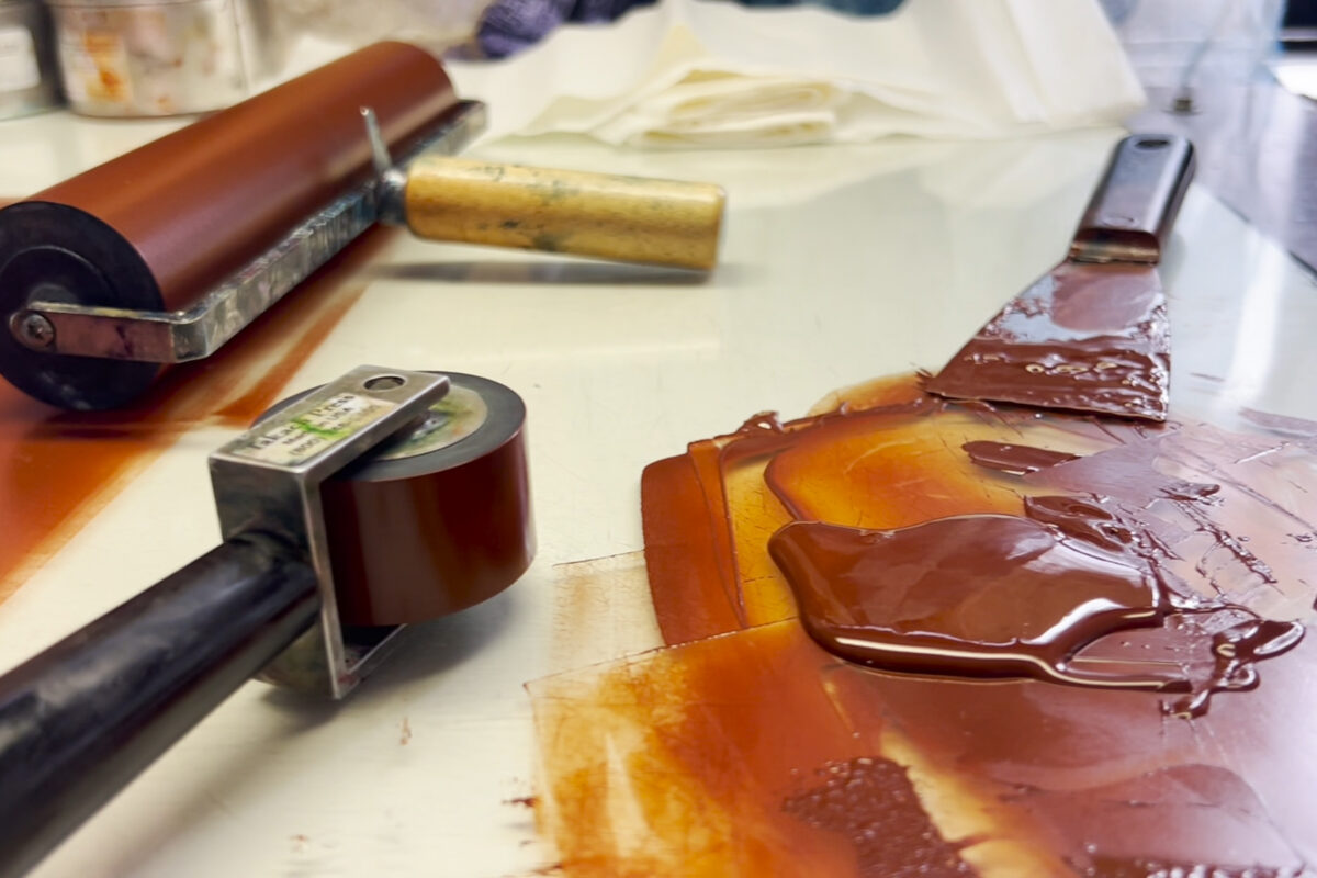
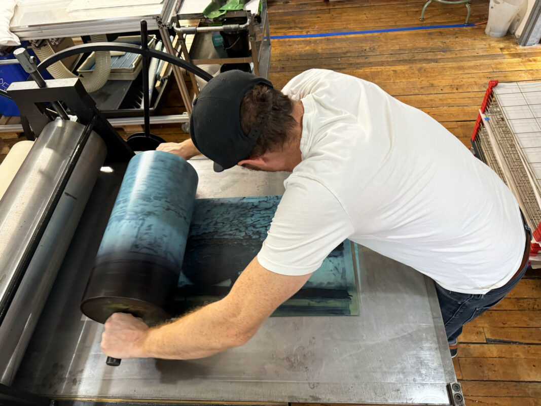
At any given time during this residency it was common to see large quantities of luscious oil-based inks out and flowing. The larger size of these prints and the use of many colours for each print meant that there were often many hours of determining the best approaches with the inks (mixing, testing, remixing, re-making...and so on!)
-
-
-
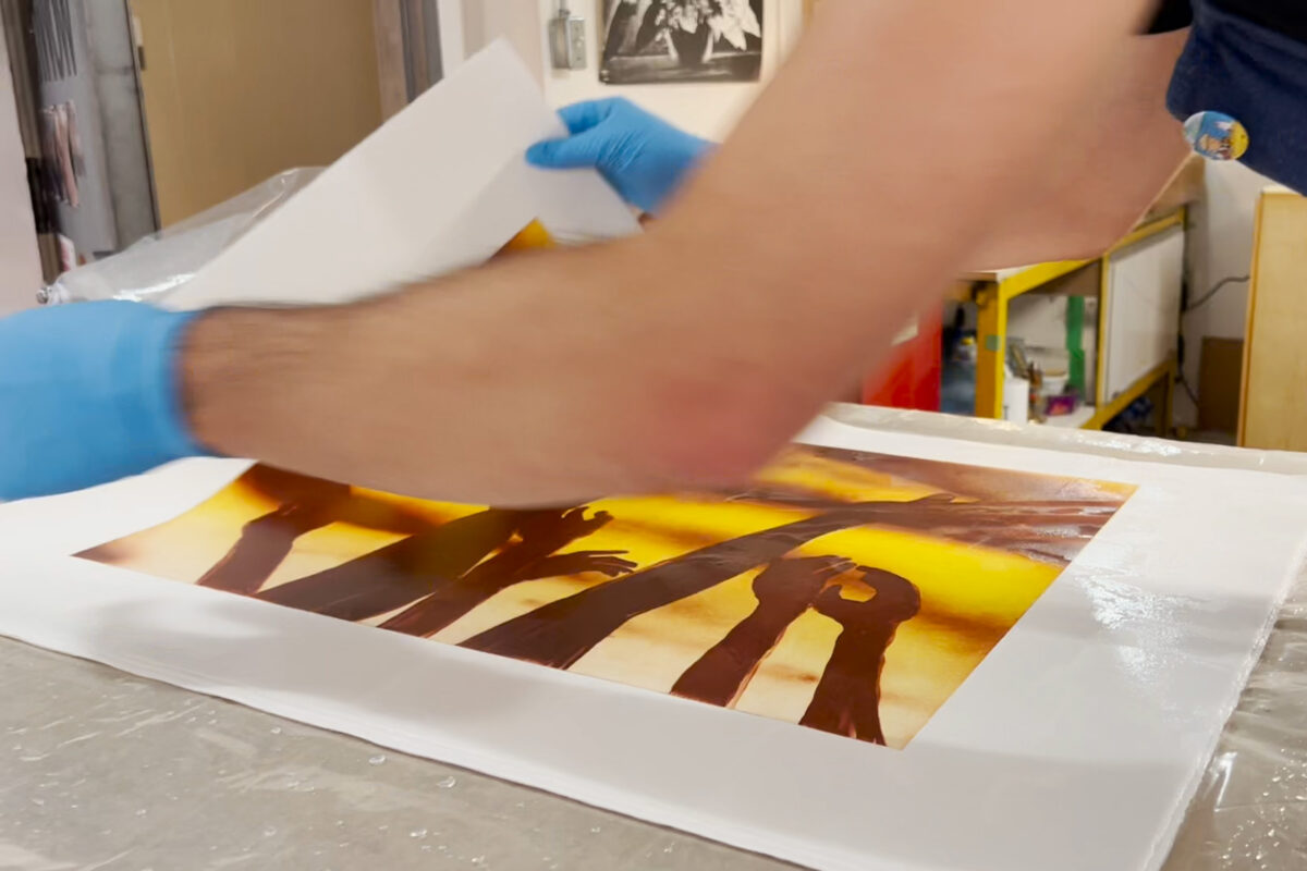
After prints are pulled, they are left for several days to dry. While the paper dries relatively quickly, the ink often takes much longer. In this process the paper often loses it's flattened shape and begins to curl. Once the ink is fully dried, the prints are re-soaked in a bath of water and then carefully pressed to return them to their flattened state.
-
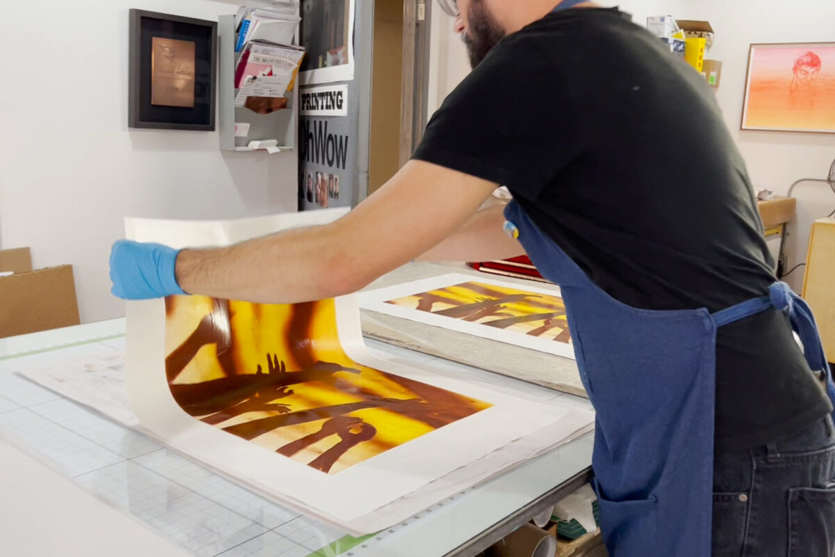
Here at Smokestack we re-soak prints for a short period before they are left to rest in a plastic "damp pack". This relaxes the fibres in the paper and let's the moisture fully saturate it. Once the paper has rested in it's dampened state, we carefully blot the paper between newsprint or blotters before they are leafed with tissue weighted under heavier boards. After this process the prints are crisp and flat once again!
-
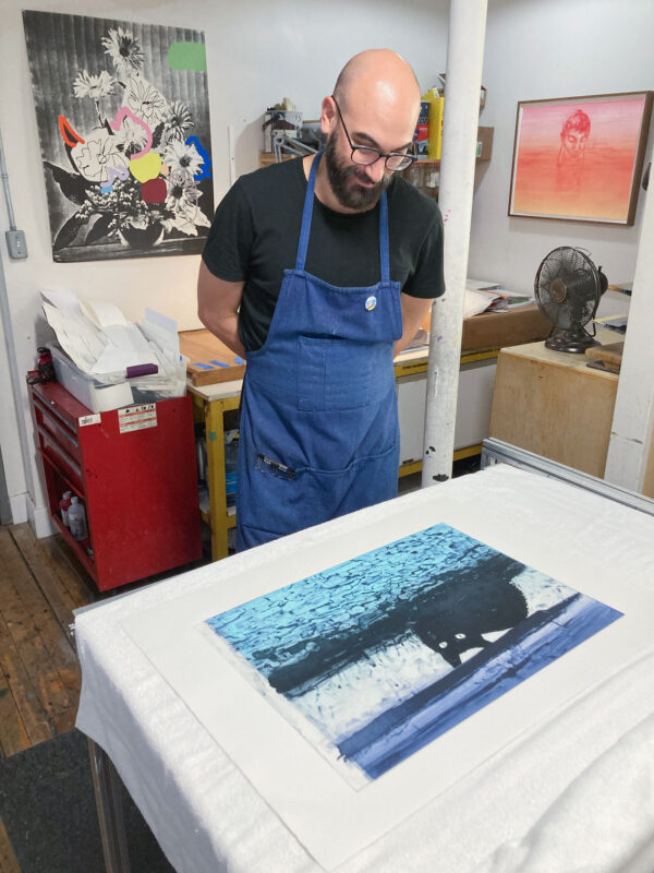
Even for those of us who spend each and every day in the print studio, there is still no end to the great surprise of pulling a print off of the press! Even though it may be part of an edition where each impression is intended to be as close to each other as possible, after all is said and done, what the plate matrix will offer up after going through the press is still unknown until it's revealed.
-
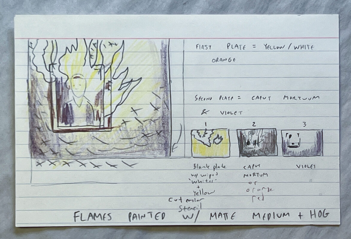
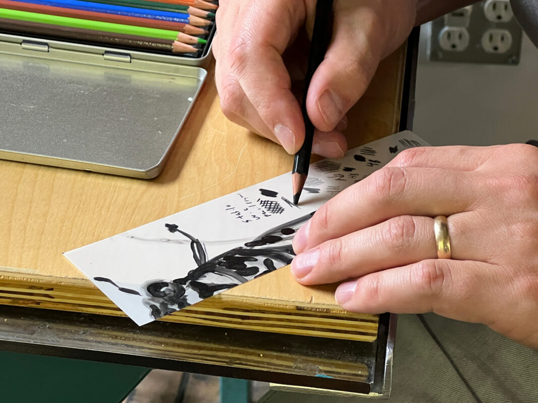
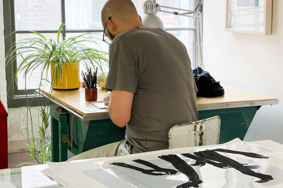
Tyler's notations and plans are such a special window into his creative and technical process. Written up like recipes, we used these as starting points to begin developing a general sense of each image before moving into a more improvised and real-time journey in the "kitchen" as we responded to the flavours that were coming together.
-
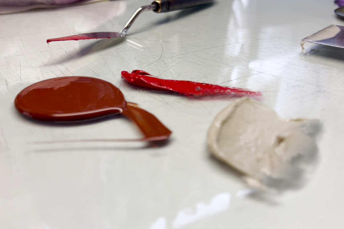
When working in the intaglio studio, we seldom use ink right from the can. Often times those inks are simply too strong in their intensity and need to be mixed with modifiers to achieve a different range of transparency or to flow / tack better in the wiping of plates. In the case of Tyler's projects during his residency, we thought a lot about how this part of the process was akin to cooking and how inks were "seasoned" to taste in order to get them hitting all the right notes on the palette!
-
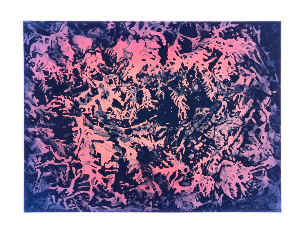
During the proofing stages of printing as well as throughout the editioning process, Tyler & Laine compare and contrast the various prints to note subtle differences from impression to impression. In this particular print, the optical mixing of colours evolved throughout the process and as they became saturated in the plates, the effect of colours interacting in the print was more and more noticeable. In this case it was the red pattern that was of considerable interest and how it began to bloom and read above the darker purple tones below.
-
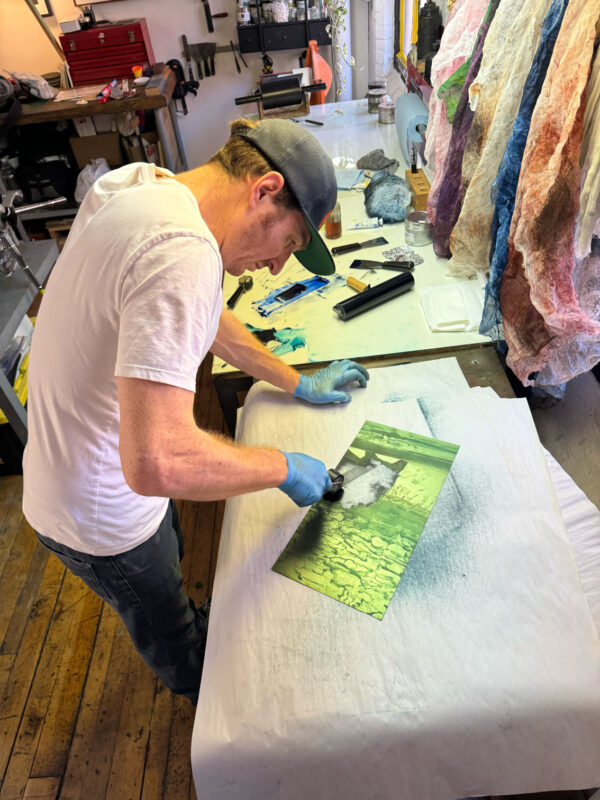
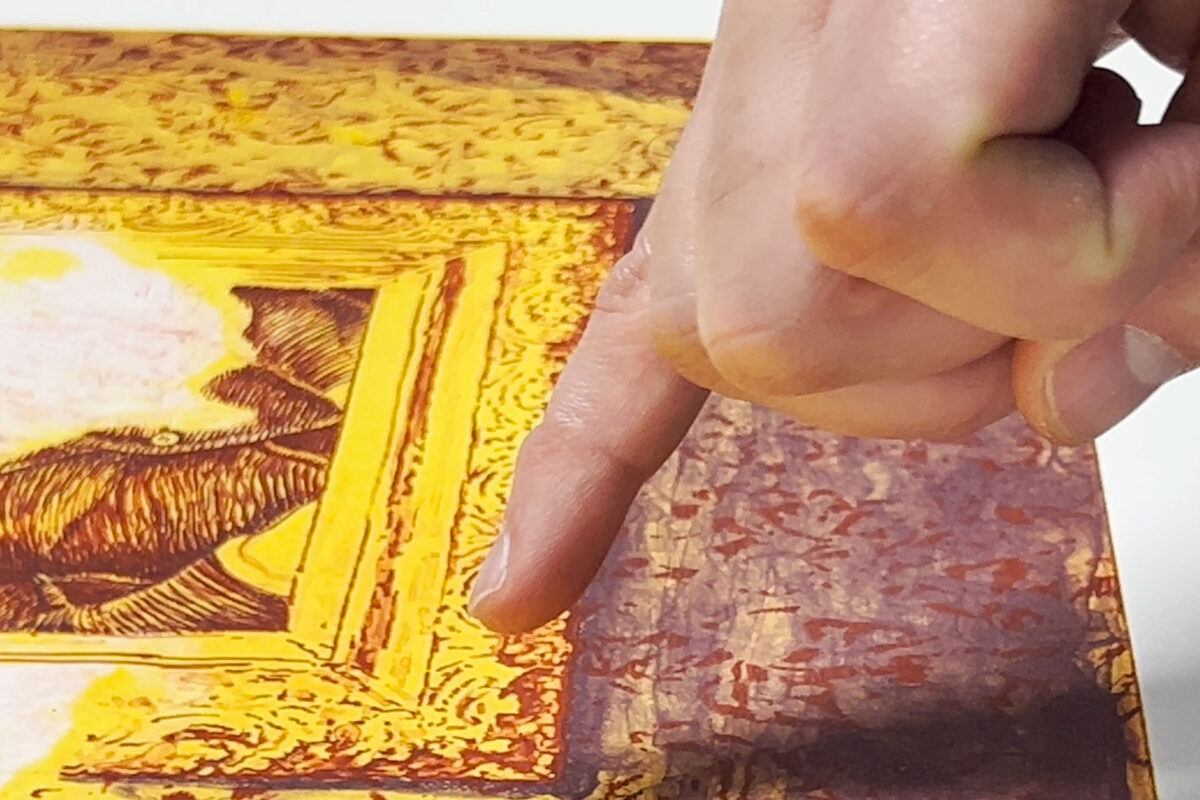
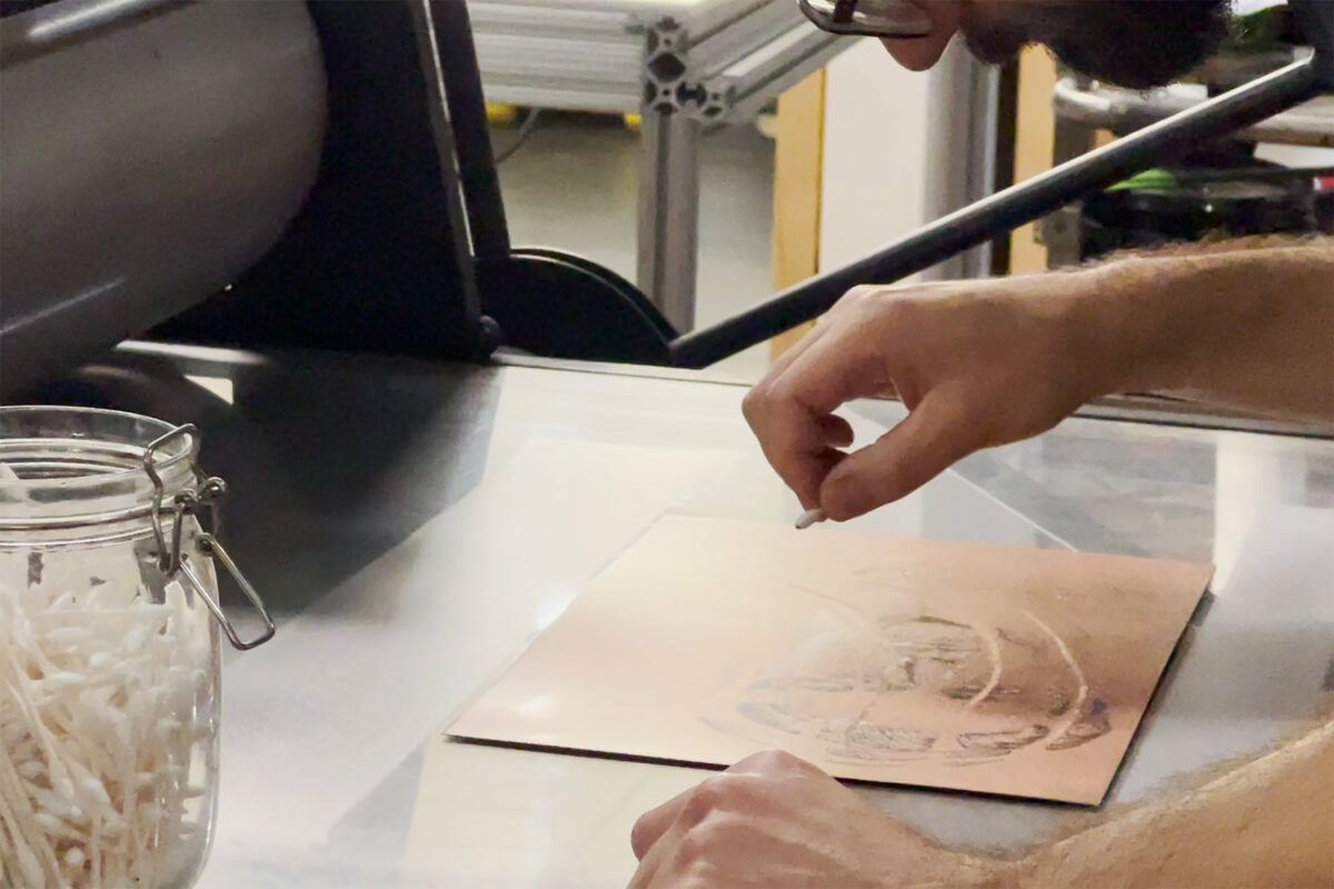
Tyler used all kinds of implements to work reductively on the inked plates. By using a mylar stencil to position his marks relative to the other plates, Tyler then began to use cotton swabs to delicately remove areas of ink to achieve highlights in the plate.
-
Seen here is the stencil that was used to drape over the inked plate so that marks would be constrained to specific zones within the image.
-
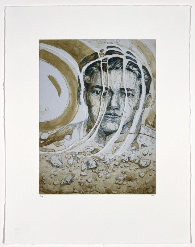
With each exhibition here at Smokestack, we always encourage artists to create an additional print that coincides with the occasion of the exhibition. This work is published by the studio and gives artists a chance to lean into some things they've learned or garnered through their experiences at Smokestack. This may be a related work, or may be something different all together. It's often approachable in scale and a way to play! In this case Tyler took interest in brining together his years of experience in copperplate etching with new-found knowledge in photopolymer gravure.
-
This print was unique from the other works produced during the residency in that it was the only piece comprised of two distinct technical approaches (etching & photopolymer gravure using a direct-to-film approach). The initial line etching was produced and then using the physical copperplate as a base, Tyler painted a film that would represent a contrasting tonal and washed form of marks to be transposed onto a photopolymer plate.
-
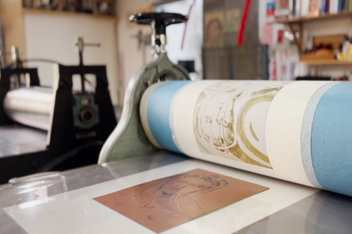
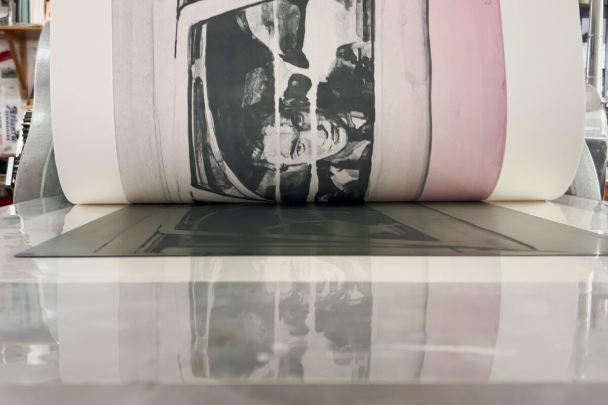
Seen here are the various image components of "Nobody has ever been here before" coming together on the press. This print included 3 plates - 1) a subtle base colour solid that was rolled 2) a photopolymer plate for tone & brush marks / washes 3) a copperplate line etching These plates were printed in succession one by one to achieve the final print.
-
Towards the later part of the residency Tyler began playing with the possibilities in working reductively on the plate...not unlike a monotype. In a number of prints including "Nobody has ever been here before" & "In front of everybody" Tyler worked back into a rolled surface of ink in order to open up unique highlights in a more gestural way.
A few words with Tyler Bright Hilton...
-
Smokestack Gallery Director, Tara Westermann (TW): From a focus on painting in the early days of your artistic practice, what initially compelled you to start working in intaglio printmaking?
Tyler Bright Hilton (TBH): Like every artist I had so much to figure out at the beginning. I’m equally interested in both formal pictorial elements and visual storytelling, which don’t always pair so easily, so narrowing things down to etching was a big help. It’s a little more narrow than painting, but it’s equally bottomless.
-
TW: Why did photopolymer gravure become the medium of focus for your residency?
TBH: For a long time now I’ve either been using fine tools to make metalpoint drawings and etchings or really crude tools like bamboo pens and cheap brushes to make paintings. I wanted to see what would happen if we braided those elements together, and working like we did (which was me making wash drawings or paintings directly onto transparent film to be exposed onto a polymer plate that was then printed by Laine in exactly the same manner as an etching plate) made that possible in an absolutely literal way. In this process the drawings I made function kind of like negatives in analog photography, so it would be like printing from a negative the exact same size as the print itself, allowing for an extremity of fidelity.
-
TW: How did the process uniquely support the imagery created in this body of work?
TBH: It’s a technical thing that of course translates into a content thing. A big part of what I love about printmaking is how it’s made by both hands and machines - for me, it’s like a handwritten diary that's been translated into type; it cools it down. Traditional etching can’t show information inside a brush mark, but gravure can. It shows more of the handmade mark and in this way it brings something new to intaglio; it warms it back up. I like very dense art that presents vibrating opposites, so this was exciting.
-
TW: You and Laine have been working together for +10 years now. How has the collaborative experience through the making of this project been?
TBH: We love working together. He listens to what I’m looking for and I know his tastes too. With some works I realize I don’t exactly know what I’m after, and those are harder days because it’s like working with the lights off. Other times I’m totally clear and we get exactly what I want almost immediately. Sometimes Laine proposes an exciting solution that hadn’t occurred to me at all and those are really fun days. I think we’ve both gotten used to treating all of this as simply part of the process, like the whole thing is research and development. It’s work, but it’s also playing.
-
TW: Your professional practice to-date has been focused on the development of the expansive Minmei Madelynne Pryor series though the images in this body of work look quite different than others you have created through the project’s development. What inspired the shift?
TBH: Well, it’s a large story divided into three acts that obliquely charts the maturing of my character. In the first two series Minmei was still in her twenties and very self-involved. By the third act, which is where we are now, she’s less solipsistic and so we see a lot less of her. My new work isn’t so much about a single person marooned in her own mind, it’s more outward facing.
At the same time, I have this grand goal of always wanting my work to somehow articulate the feeling of thinking, to illustrate a sense of near-revelation: a moment when something difficult to articulate is glimpsed or intuited but not yet comprehensible, like a word on the tip of a tongue or a dream that feels full of significant insights but fades maddeningly from memory on waking.
-
Tyler-Bright-Hilton-Smokestack_analog-residency_BTS_16
-
Tyler Bright Hilton – That’s how it starts
- photopolymer gravure
- edition of 5
- 16.5" x 22.5"
- 2024
$1,800.00
-
Tyler Bright Hilton – Your head’s a bad neighborhood
- photopolymer gravure
- edition of 5
- 16.5" x 22.5"
- 2024
$1,800.00
-
Tyler Bright Hilton – Everything seemed to tremble a little
- photopolymer gravure
- edition of 5
- 16.5" x 22.5"
- 2024
$1,800.00
-
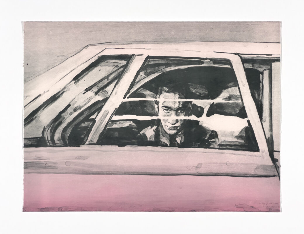
Tyler Bright Hilton – The surface is what’s there
- photopolymer gravure
- edition of 5
- 16.5" x 22.5"
- 2024
$1,800.00
-
Tyler Bright Hilton – In front of everybody
- photopolymer gravure
- edition of 5
- 16.5" x 22.5"
- 2024
$1,800.00
-
Tyler Bright Hilton – Nobody has ever been here before
- photopolymer gravure and etching
- edition of 5
- 18" x 14"
- 2024
$800.00
This project was made possible with support from: